3D Text Creative Inspiration

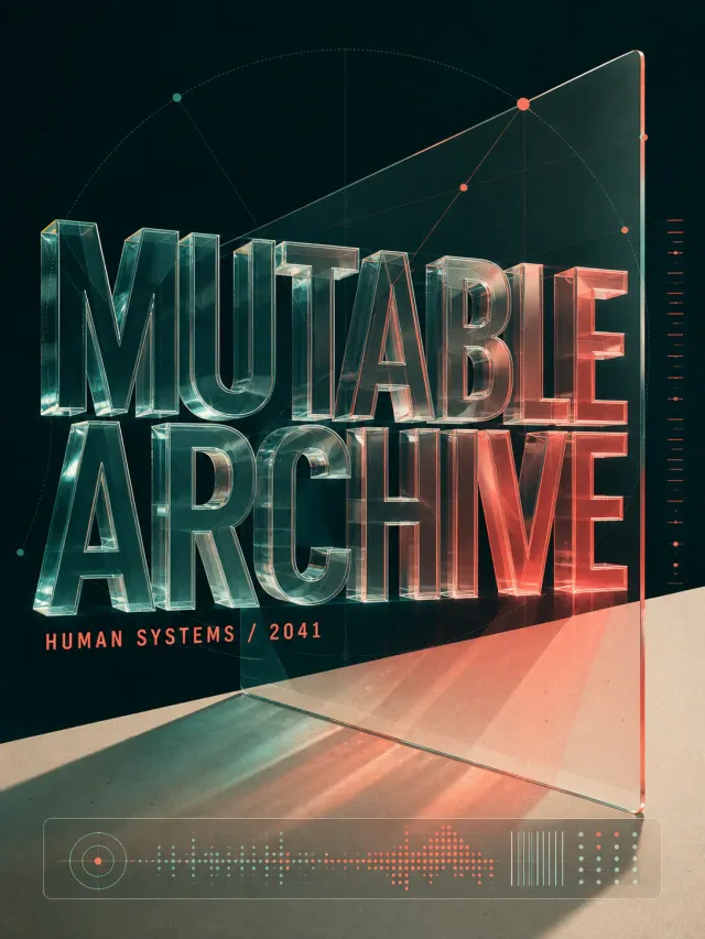
Use case: ads-marketing Asset type: experimental typographic poster Primary request: design a polished poster for a human-centered technology forum. Subject: a translucent interface fragment, coordinate dots, and a compact data strip. Style/medium: contemporary graphic design with deconstructed typography and crisp print-quality detail. Composition/framing: 3:4 canvas; large letterforms treated as translucent, extruded, folded, or luminous physical objects within a sparse poster field; build a spatial composition with depth, perspective, extrusion, or layered planes while keeping the headline readable. Typography: material lighting and depth define the typography while the silhouette remains legible. Render the headline "MUTABLE ARCHIVE" exactly once and the secondary line "HUMAN SYSTEMS / 2041" exactly once. Color palette: dark teal, coral red, and paper beige. Constraints: readable headline, deliberate hierarchy, clean edges, balanced negative space, no extra words, no logos, no trademarks, no watermark.

Original English surprise-deals poster in lavender, purple, and white. Text: “SURPRISE MEGA DEALS”, “SPECIAL OFFER”. No brand, watermark, QR code, website, non-English text, or random tiny text.

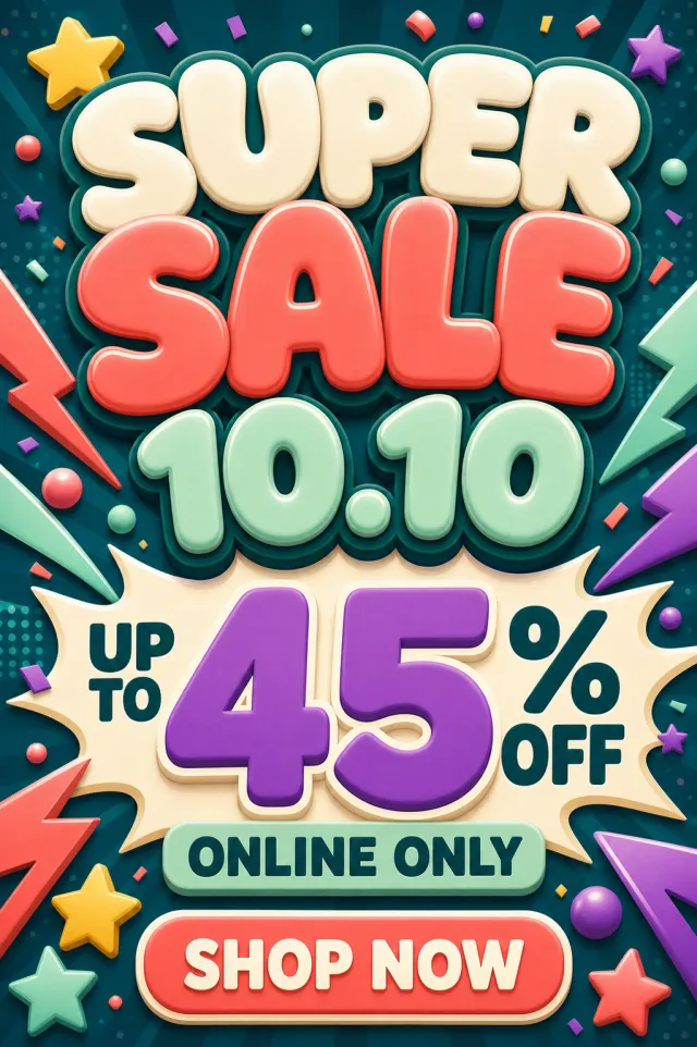
Create a fresh portrait-format double-date shopping sale poster with bubbly headline lettering. Use a youthful palette of deep teal, coral, mint, cream, and violet. Set the exact headline text to “SUPER SALE 10.10” in large rounded uppercase lettering. Make “UP TO 45% OFF” the dominant offer and add the exact supporting line “ONLINE ONLY”. Include the exact call to action “SHOP NOW” inside a clear rounded button near the bottom. Use lightning ribbons, floating stars, soft 3D bubbles, and compact confetti for high energy. Do not include any brand names, social-media logos, watermarks, barcodes, QR codes, URLs, or fine print. Render as a polished static portrait PNG with strong hierarchy and clean readable typography.

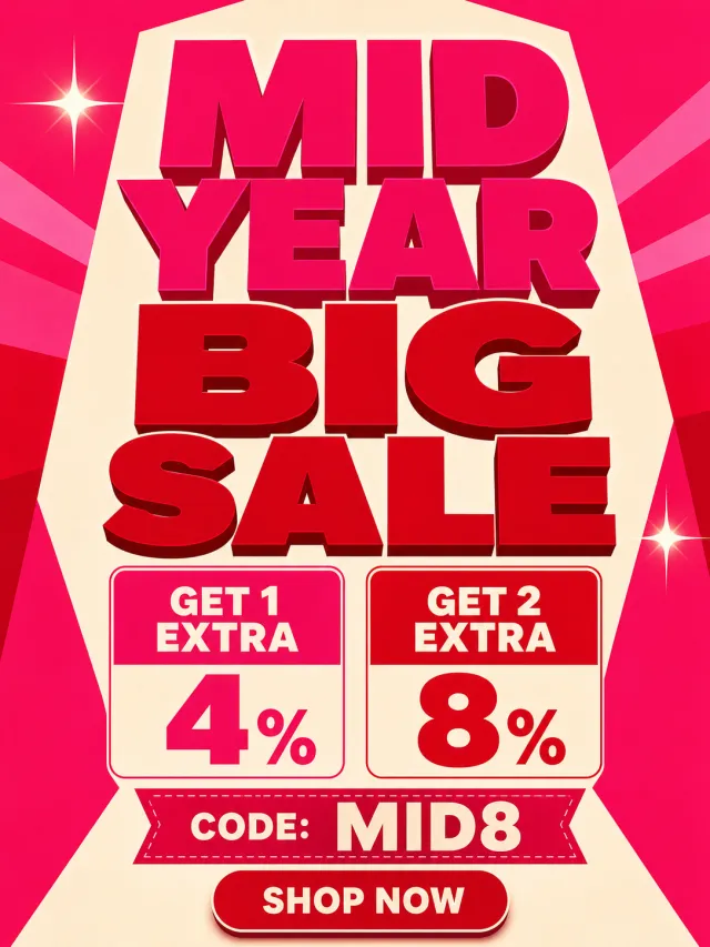
Create an original portrait 3:4 English mid-year sale poster in hot pink, red, and cream, with a bold stacked headline, two compact offer panels, a coupon code, and a small shop button. Text: “MID YEAR BIG SALE”, “GET 1 EXTRA 4%”, “GET 2 EXTRA 8%”, “CODE: MID8”, “SHOP NOW”. Use two balanced shine accents only. No brand, watermark, QR code, website, non-English text, or random tiny text.

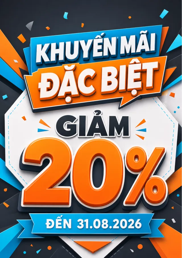
Create a new original coupon or sale design: high-impact seasonal sale poster with dimensional display lettering, layered paper shapes, confetti, and a clear central offer. Style: clean commercial graphic, polished and print-ready, with harmonious charcoal, electric cyan, and tangerine. Layout: Vertical poster composition preserving the source-like hierarchy of headline, large value, supporting line, and date while using entirely new shapes and spacing. Main text exactly: "KHUYẾN MÃI ĐẶC BIỆT", "GIẢM 20%", "ĐẾN 31.08.2026". Language: Vietnamese; keep that language and script only, preserve its natural typographic hierarchy, and do not translate. Design changes: use a different dominant palette, rearrange icons and patterns, and redesign borders, corners, perforations, shadows, gradients, and decorative angles. Background: Use a newly colored commercial backdrop with no copied texture or decoration. Remove every brand, store or platform name, logo, watermark, website, QR code, author mark, barcode, and any note beginning with "*". Avoid exact copying, original colors, copyrighted elements, random text, tiny unreadable legal text, misspellings, fake logos, and scannable codes.

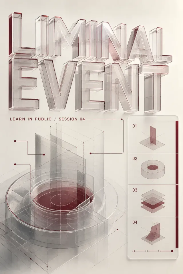
Use case: ads-marketing Asset type: experimental typographic poster Primary request: design a polished poster for an open learning festival. Subject: a diagram fragment, annotation lines, and a modular lesson index. Style/medium: contemporary graphic design with deconstructed typography and crisp print-quality detail. Composition/framing: 2:3 canvas; large letterforms treated as translucent, extruded, folded, or luminous physical objects within a sparse poster field; build a spatial composition with depth, perspective, extrusion, or layered planes while keeping the headline readable. Typography: material lighting and depth define the typography while the silhouette remains legible. Render the headline "LIMINAL EVENT" exactly once and the secondary line "LEARN IN PUBLIC / SESSION 04" exactly once. Color palette: cream, burgundy, and cool gray. Constraints: readable headline, deliberate hierarchy, clean edges, balanced negative space, no extra words, no logos, no trademarks, no watermark.
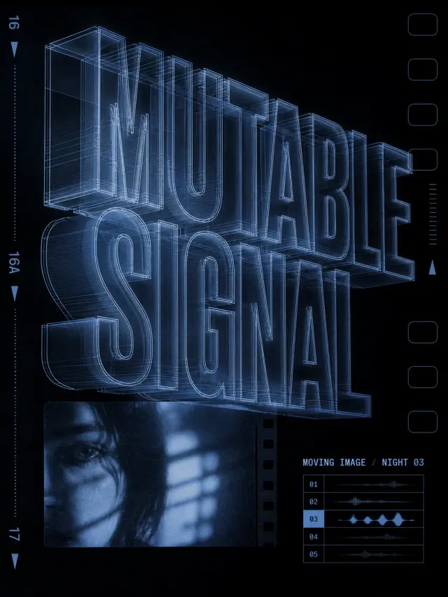
Use case: ads-marketing Asset type: experimental typographic poster Primary request: design a polished poster for an independent film program. Subject: a cinematic still fragment, film-frame marks, and a small screening index. Style/medium: contemporary graphic design with deconstructed typography and crisp print-quality detail. Composition/framing: 3:4 canvas; large letterforms treated as translucent, extruded, folded, or luminous physical objects within a sparse poster field; reduce the composition to one main typographic gesture, strong negative space, and one compact information cluster. Typography: material lighting and depth define the typography while the silhouette remains legible. Render the headline "MUTABLE SIGNAL" exactly once and the secondary line "MOVING IMAGE / NIGHT 03" exactly once. Color palette: blue-black, ice blue, and chrome gray. Constraints: readable headline, deliberate hierarchy, clean edges, balanced negative space, no extra words, no logos, no trademarks, no watermark.
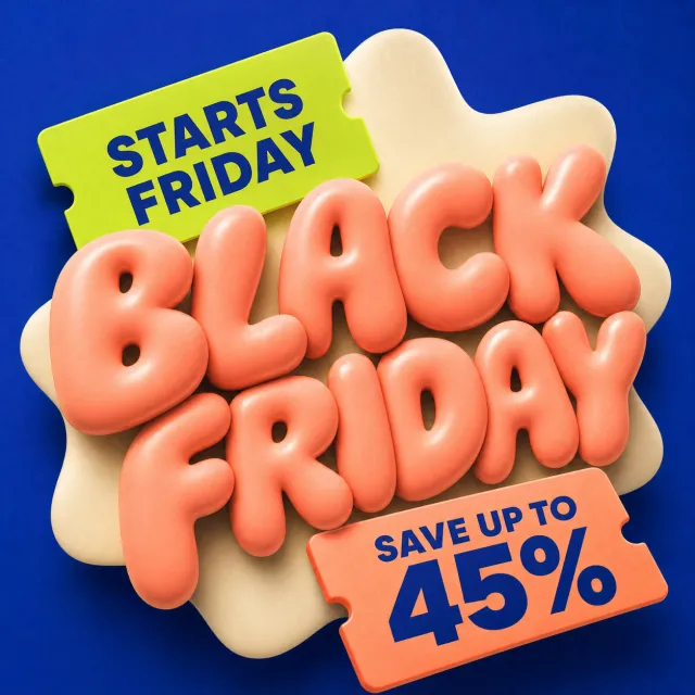
Create a new original English Black Friday teaser with playful inflated 3D lettering. Style: soft glossy typography, tilted ticket tabs, subtle grain, premium retail polish. Layout: square composition with a central two-line title, one timing tab, and one large discount ticket. Main text: "BLACK FRIDAY", "STARTS FRIDAY", "SAVE UP TO 45%". Language: English only; keep every phrase correctly spelled. Design changes: use deep cobalt, peach, acid green, and cream with an entirely rearranged composition. Background: clean dark cobalt square background with a soft cream organic panel. Remove: watermark, brand logo, QR code, website, author mark, fine print, and any note starting with "*". Avoid: exact copying, original colors, random tiny text, misspelled text, and copyrighted brand elements.

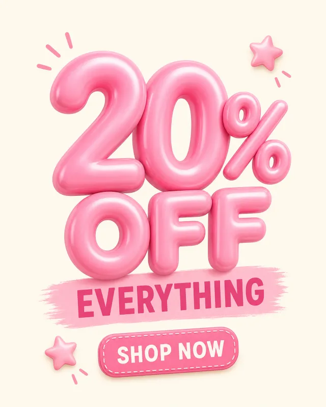
Original portrait English pink discount poster with large inflated percentage. Text: “20% OFF”, “EVERYTHING”, “SHOP NOW”. No brand, watermark, QR code, website, non-English text, or random tiny text.

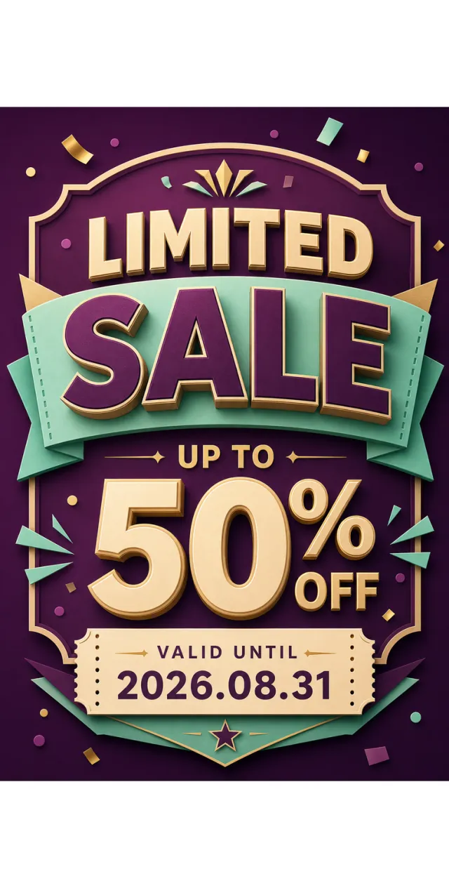
Create a new original coupon or sale design: high-impact seasonal sale poster with dimensional display lettering, layered paper shapes, confetti, and a clear central offer. Style: clean commercial graphic, polished and print-ready, with harmonious plum, mint, and champagne gold. Layout: Vertical poster composition preserving the source-like hierarchy of headline, large value, supporting line, and date while using entirely new shapes and spacing. Main text exactly: "LIMITED SALE", "UP TO 50% OFF", "VALID UNTIL 2026.08.31". Language: English; keep that language and script only, preserve its natural typographic hierarchy, and do not translate. Design changes: use a different dominant palette, rearrange icons and patterns, and redesign borders, corners, perforations, shadows, gradients, and decorative angles. Background: Use a newly colored commercial backdrop with no copied texture or decoration. Remove every brand, store or platform name, logo, watermark, website, QR code, author mark, barcode, and any note beginning with "*". Avoid exact copying, original colors, copyrighted elements, random text, tiny unreadable legal text, misspellings, fake logos, and scannable codes.

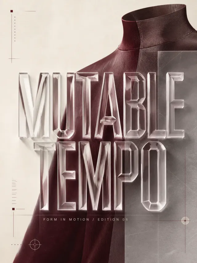
Use case: ads-marketing Asset type: experimental typographic poster Primary request: design a polished poster for an experimental fashion editorial. Subject: a cropped garment silhouette, fabric texture, and editorial folio marks. Style/medium: contemporary graphic design with deconstructed typography and crisp print-quality detail. Composition/framing: 3:4 canvas; large letterforms treated as translucent, extruded, folded, or luminous physical objects within a sparse poster field; translate the typographic mechanism into tactile paper, transparent film, or printed-ink material behavior. Typography: material lighting and depth define the typography while the silhouette remains legible. Render the headline "MUTABLE TEMPO" exactly once and the secondary line "FORM IN MOTION / EDITION 06" exactly once. Color palette: cream, burgundy, and cool gray. Constraints: readable headline, deliberate hierarchy, clean edges, balanced negative space, no extra words, no logos, no trademarks, no watermark.
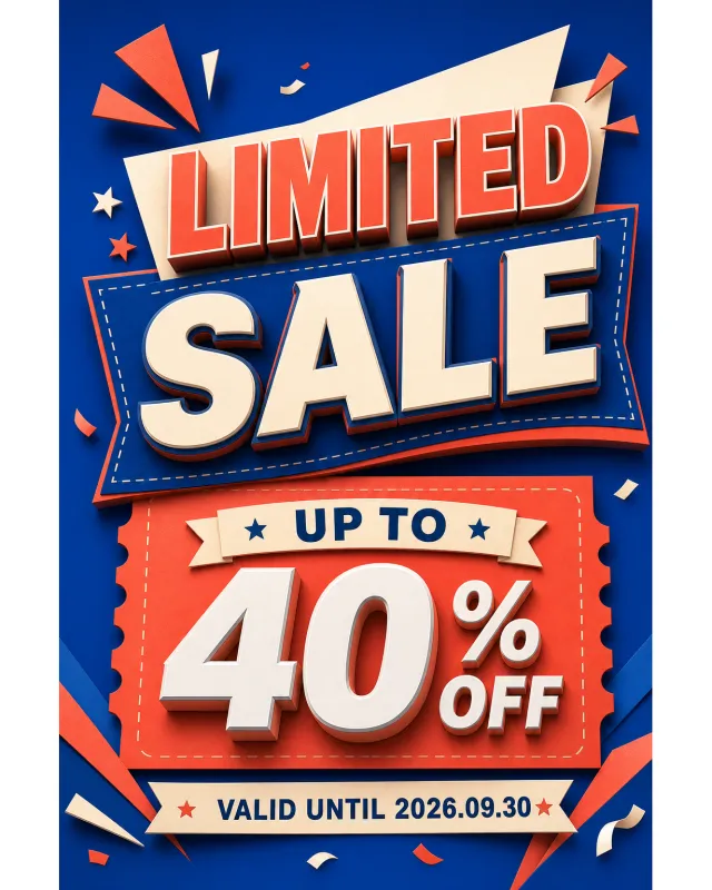
Create a new original coupon or sale design: high-impact seasonal sale poster with dimensional display lettering, layered paper shapes, confetti, and a clear central offer. Style: clean commercial graphic, polished and print-ready, with harmonious deep cobalt, warm ivory, and coral. Layout: Vertical poster composition preserving the source-like hierarchy of headline, large value, supporting line, and date while using entirely new shapes and spacing. Main text exactly: "LIMITED SALE", "UP TO 40% OFF", "VALID UNTIL 2026.09.30". Language: English; keep that language and script only, preserve its natural typographic hierarchy, and do not translate. Design changes: use a different dominant palette, rearrange icons and patterns, and redesign borders, corners, perforations, shadows, gradients, and decorative angles. Background: Use a newly colored commercial backdrop with no copied texture or decoration. Remove every brand, store or platform name, logo, watermark, website, QR code, author mark, barcode, and any note beginning with "*". Avoid exact copying, original colors, copyrighted elements, random text, tiny unreadable legal text, misspellings, fake logos, and scannable codes.

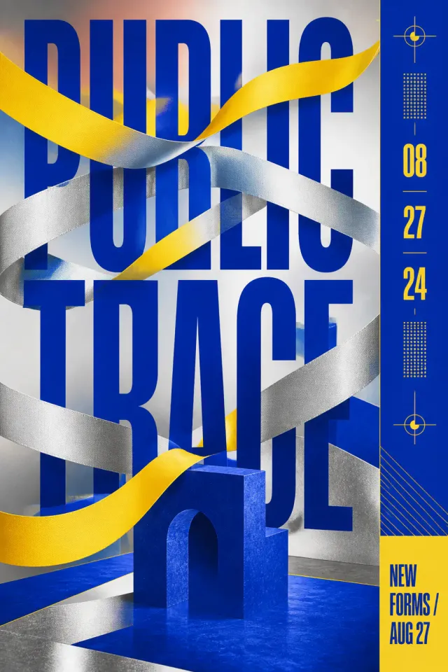
Use case: ads-marketing Asset type: experimental typographic poster Primary request: design a polished poster for a contemporary design exhibition. Subject: an abstract gallery object, registration marks, and a slim date column. Style/medium: contemporary graphic design with deconstructed typography and crisp print-quality detail. Composition/framing: 2:3 canvas; headline forms compressed, pinched, masked, or crossed by ribbons and bars, with a clear central pressure point; build a spatial composition with depth, perspective, extrusion, or layered planes while keeping the headline readable. Typography: occlusion becomes the main visual device without erasing the word structure. Render the headline "PUBLIC TRACE" exactly once and the secondary line "NEW FORMS / AUG 27" exactly once. Color palette: ultramarine, soft silver, and bright yellow. Constraints: readable headline, deliberate hierarchy, clean edges, balanced negative space, no extra words, no logos, no trademarks, no watermark.

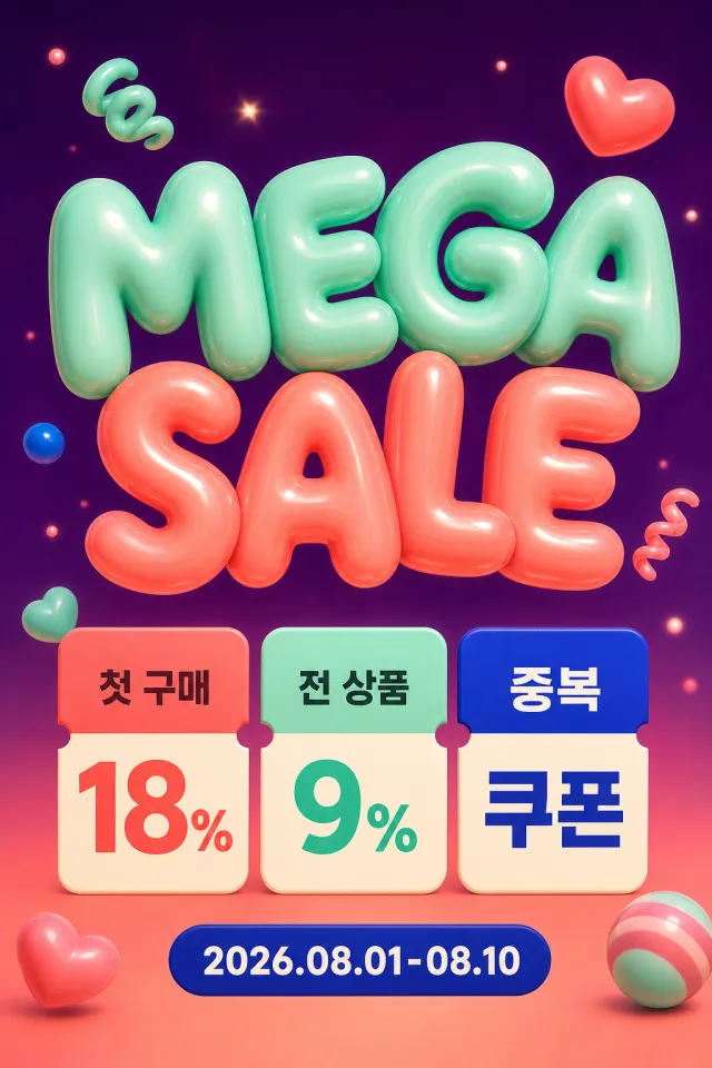
Create a brand-new Korean Mega Sale vertical poster. Accurately display the text “MEGA SALE”“첫 구매 18%”“전 상품 9%”“중복 쿠폰”“2026.08.01-08.10”. Use deep plum purple, mint green, coral orange, creamy white, and cobalt blue. Place inflated bubble headlines above three clear benefit cards. Add candy-like floating shapes and a soft gradient background. Korean and English must be bold, centered, and clearly readable. Do not include app brands, logos, URLs, QR codes, watermarks, or tiny text. Output a high-quality static PNG.

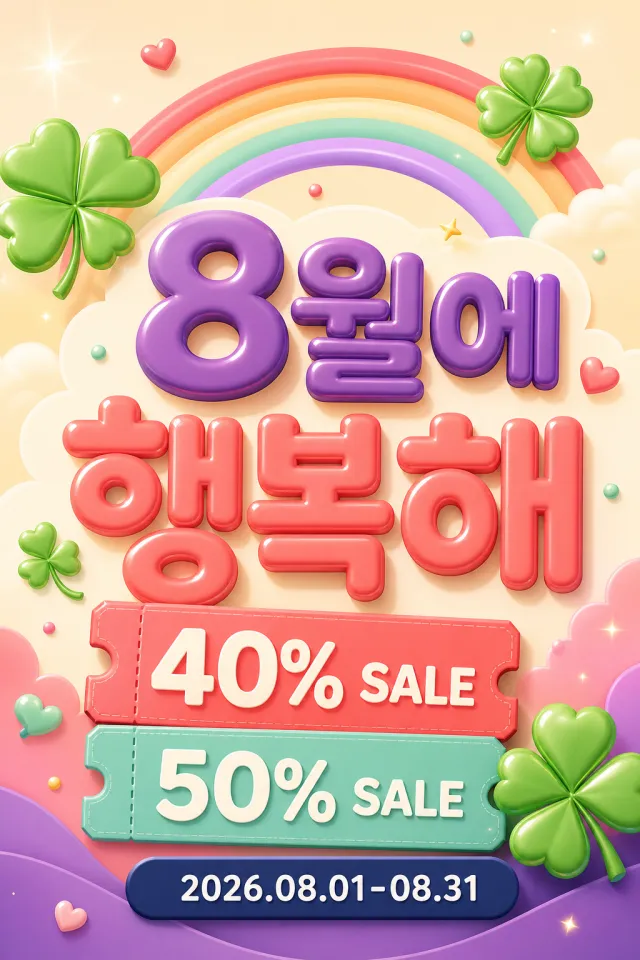
Create a brand-new Korean-language monthly happiness discount vertical poster. Accurately display the text “8월에 행복해”“40% SALE”“50% SALE”“2026.08.01-08.31”. Use plum purple, coral orange, mint green, cream white, and navy blue. Employ rainbow motifs, four-leaf clovers, and two coupon labels to form a bright, vertical design. The Korean headline and discount information must stand out and be clearly legible. Incorporate soft 3D typography and a lively retail atmosphere. Do not include any material watermarks, brand names, logos, website URLs, QR codes, or random small text. Output a high-quality static PNG image.

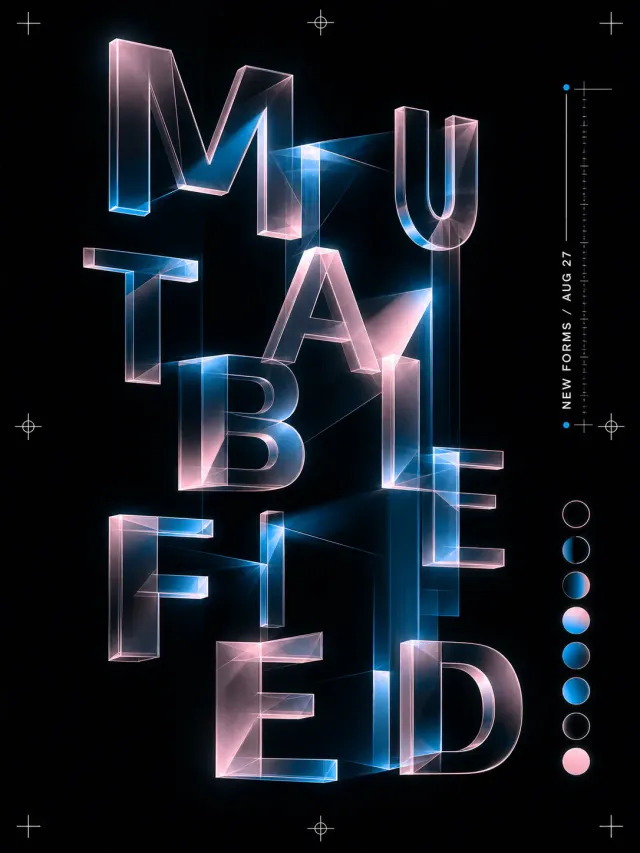
Use case: ads-marketing Asset type: experimental typographic poster Primary request: design a polished poster for a contemporary design exhibition. Subject: an abstract gallery object, registration marks, and a slim date column. Style/medium: contemporary graphic design with deconstructed typography and crisp print-quality detail. Composition/framing: 3:4 canvas; large letterforms treated as translucent, extruded, folded, or luminous physical objects within a sparse poster field; organize the typography with a strong primary mass, measured secondary information, clear negative space, and one decisive directional rhythm. Typography: material lighting and depth define the typography while the silhouette remains legible. Render the headline "MUTABLE FIELD" exactly once and the secondary line "NEW FORMS / AUG 27" exactly once. Color palette: ink black, pale pink, and electric cyan. Constraints: readable headline, deliberate hierarchy, clean edges, balanced negative space, no extra words, no logos, no trademarks, no watermark.
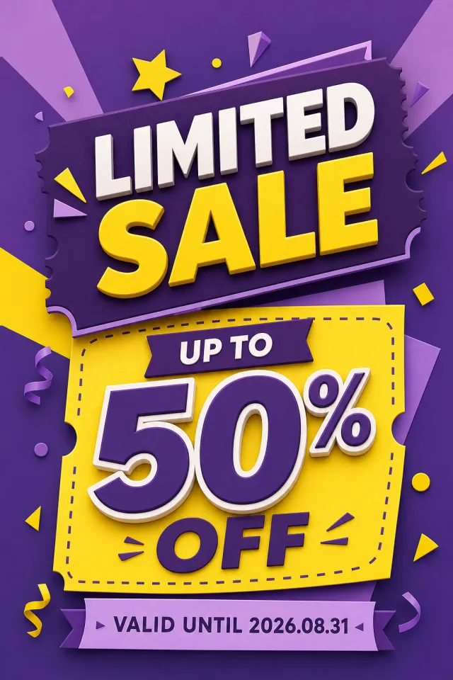
Create a new original coupon or sale design: high-impact seasonal sale poster with dimensional display lettering, layered paper shapes, confetti, and a clear central offer. Style: clean commercial graphic, polished and print-ready, with harmonious aubergine, lemon, and soft lilac. Layout: Vertical poster composition preserving the source-like hierarchy of headline, large value, supporting line, and date while using entirely new shapes and spacing. Main text exactly: "LIMITED SALE", "UP TO 50% OFF", "VALID UNTIL 2026.08.31". Language: English; keep that language and script only, preserve its natural typographic hierarchy, and do not translate. Design changes: use a different dominant palette, rearrange icons and patterns, and redesign borders, corners, perforations, shadows, gradients, and decorative angles. Background: Use a newly colored commercial backdrop with no copied texture or decoration. Remove every brand, store or platform name, logo, watermark, website, QR code, author mark, barcode, and any note beginning with "*". Avoid exact copying, original colors, copyrighted elements, random text, tiny unreadable legal text, misspellings, fake logos, and scannable codes.

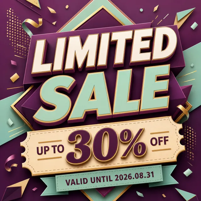
Create a new original coupon or sale design: high-impact seasonal sale poster with dimensional display lettering, layered paper shapes, confetti, and a clear central offer. Style: clean commercial graphic, polished and print-ready, with harmonious plum, mint, and champagne gold. Layout: Square promotional composition with a strong centered hierarchy and balanced margins. Main text exactly: "LIMITED SALE", "UP TO 30% OFF", "VALID UNTIL 2026.08.31". Language: English; keep that language and script only, preserve its natural typographic hierarchy, and do not translate. Design changes: use a different dominant palette, rearrange icons and patterns, and redesign borders, corners, perforations, shadows, gradients, and decorative angles. Background: Use a newly colored commercial backdrop with no copied texture or decoration. Remove every brand, store or platform name, logo, watermark, website, QR code, author mark, barcode, and any note beginning with "*". Avoid exact copying, original colors, copyrighted elements, random text, tiny unreadable legal text, misspellings, fake logos, and scannable codes.

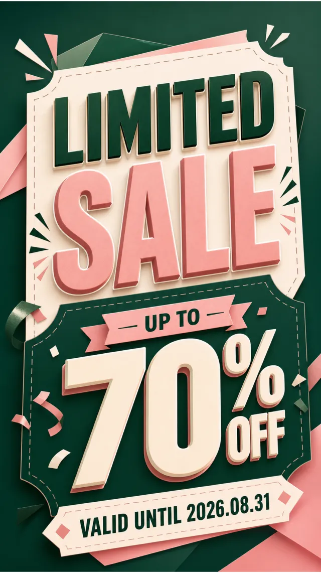
Create a new original coupon or sale design: high-impact seasonal sale poster with dimensional display lettering, layered paper shapes, confetti, and a clear central offer. Style: clean commercial graphic, polished and print-ready, with harmonious forest green, blush, and cream. Layout: Vertical poster composition preserving the source-like hierarchy of headline, large value, supporting line, and date while using entirely new shapes and spacing. Main text exactly: "LIMITED SALE", "UP TO 70% OFF", "VALID UNTIL 2026.08.31". Language: English; keep that language and script only, preserve its natural typographic hierarchy, and do not translate. Design changes: use a different dominant palette, rearrange icons and patterns, and redesign borders, corners, perforations, shadows, gradients, and decorative angles. Background: Use a newly colored commercial backdrop with no copied texture or decoration. Remove every brand, store or platform name, logo, watermark, website, QR code, author mark, barcode, and any note beginning with "*". Avoid exact copying, original colors, copyrighted elements, random text, tiny unreadable legal text, misspellings, fake logos, and scannable codes.

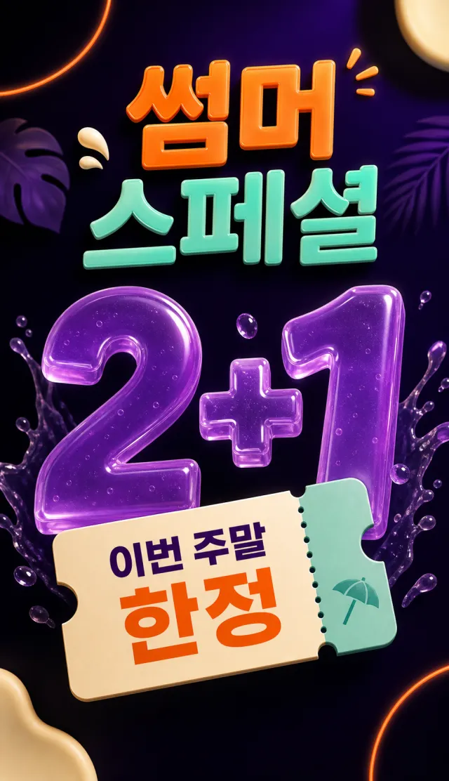
Create a new vertical Korean-language summer promotion poster, emphasizing large 3D numbers. Style: Semi‑transparent jelly numbers, rounded tickets, sleek neon lighting and three-dimensional shadows. Layout: Vertical composition, with a headline at the top, a 2+1 offer in the center, and weekend‑limited tickets at the bottom. Exact wording: "썸머 스페셜", "2+1", "이번 주말 한정". Language: Use only Korean and numbers; do not translate into other languages. Design changes: Utilize rich purple, vivid orange, mint, and cream, and rearrange decorative placements. Background: Dark purple base with gentle liquid wave patterns and an orange light ring. Removals: Brands, logos, watermarks, URLs, QR codes, asterisk notes, and small terms and conditions. Avoidances: Original replication, original colors, random small text, typos, and copyright‑related brand elements.

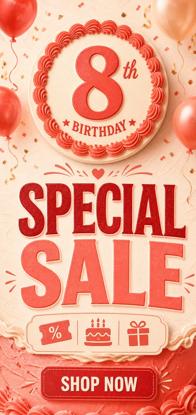
Original English birthday sale poster. Text: “8th BIRTHDAY”, “SPECIAL SALE”, “SHOP NOW”. No brand, watermark, QR code, website, non-English text, or random tiny text.

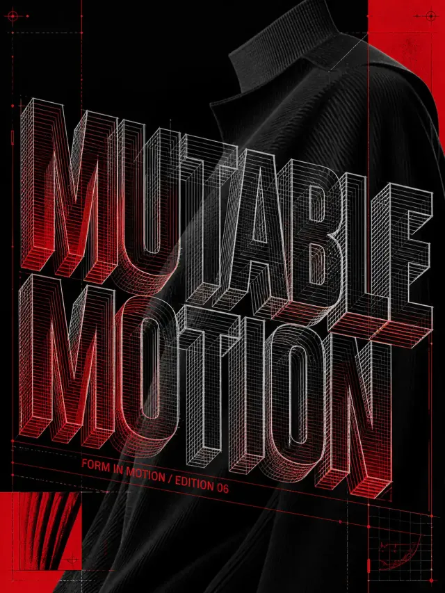
Use case: ads-marketing Asset type: experimental typographic poster Primary request: design a polished poster for an experimental fashion editorial. Subject: a cropped garment silhouette, fabric texture, and editorial folio marks. Style/medium: contemporary graphic design with deconstructed typography and crisp print-quality detail. Composition/framing: 3:4 canvas; large letterforms treated as translucent, extruded, folded, or luminous physical objects within a sparse poster field; use an energetic full-bleed field with vivid color contrast, image fragments, and a precise visual rhythm. Typography: material lighting and depth define the typography while the silhouette remains legible. Render the headline "MUTABLE MOTION" exactly once and the secondary line "FORM IN MOTION / EDITION 06" exactly once. Color palette: deep black, chalk white, and signal red. Constraints: readable headline, deliberate hierarchy, clean edges, balanced negative space, no extra words, no logos, no trademarks, no watermark.
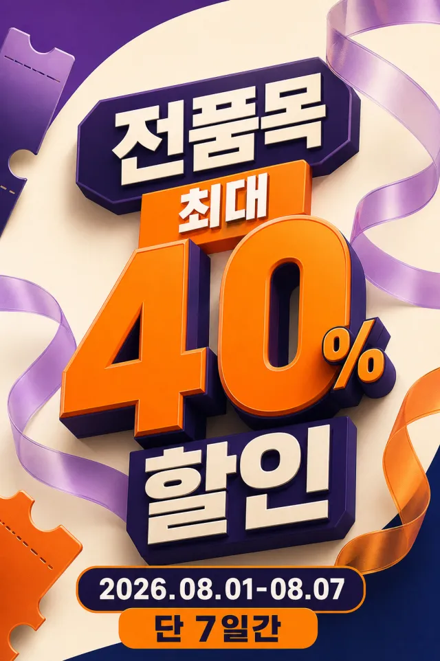
Create a new Korean-language discount poster for all items, with a clear vertical numerical hierarchy. Style: Three-dimensional numbers, semi-transparent ribbons, rounded ticket fragments, sophisticated commercial graphics. Layout: Vertical 2:3 composition, with a discount title at the top, 40% in the center, and the period and limited-time message at the bottom. Exact wording: "전품목 최대 40% 할인", "2026.08.01-08.07", "단 7일간". Language: Use only Korean and numbers; do not translate into other languages. Design changes: Incorporate purple, orange, cream, and dark navy blue, and rearrange decorative elements’ positions and angles. Background: Bright cream background with soft purple curves and natural three-dimensional shadows. Removals: Brands, logos, watermarks, URLs, QR codes, asterisk notes, and small terms and conditions. Avoidances: Original replication, original colors, random small text, typos, and copyright‑related brand elements.

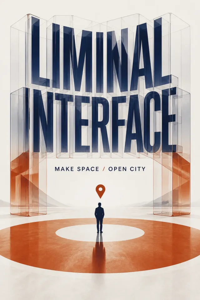
Use case: ads-marketing Asset type: experimental typographic poster Primary request: design a polished poster for a public-space awareness campaign. Subject: a simplified civic symbol, a human silhouette, and an open-area marker. Style/medium: contemporary graphic design with deconstructed typography and crisp print-quality detail. Composition/framing: 2:3 canvas; large letterforms treated as translucent, extruded, folded, or luminous physical objects within a sparse poster field; translate the typographic mechanism into tactile paper, transparent film, or printed-ink material behavior. Typography: material lighting and depth define the typography while the silhouette remains legible. Render the headline "LIMINAL INTERFACE" exactly once and the secondary line "MAKE SPACE / OPEN CITY" exactly once. Color palette: off-white, rust orange, and midnight navy. Constraints: readable headline, deliberate hierarchy, clean edges, balanced negative space, no extra words, no logos, no trademarks, no watermark.
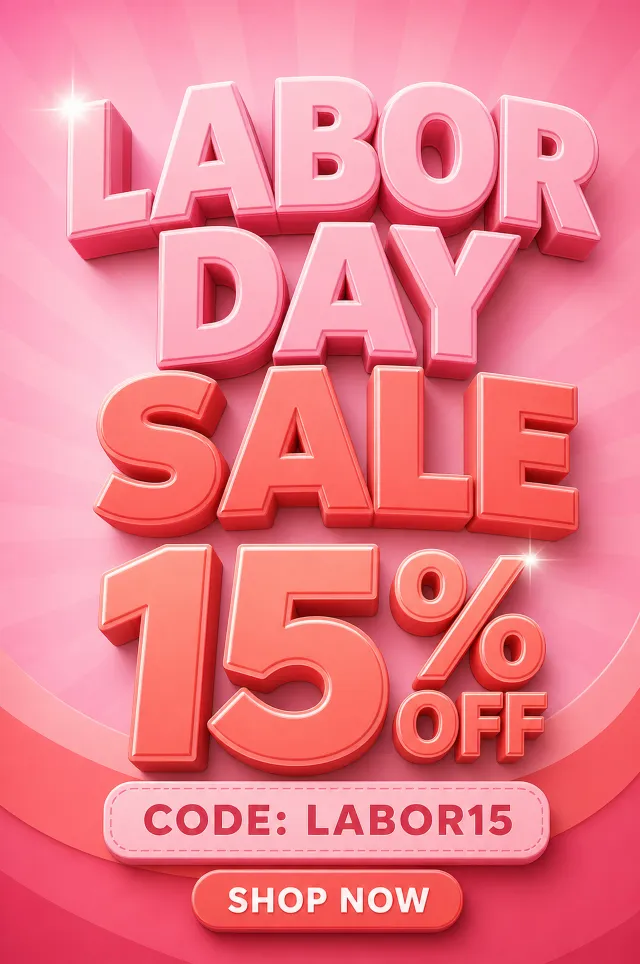
Original portrait English Labor Day sale poster in pink and coral. Text: “LABOR DAY SALE”, “15% OFF”, “CODE: LABOR15”, “SHOP NOW”. Two shine accents only. No brand, watermark, QR code, website, non-English text, or random tiny text.

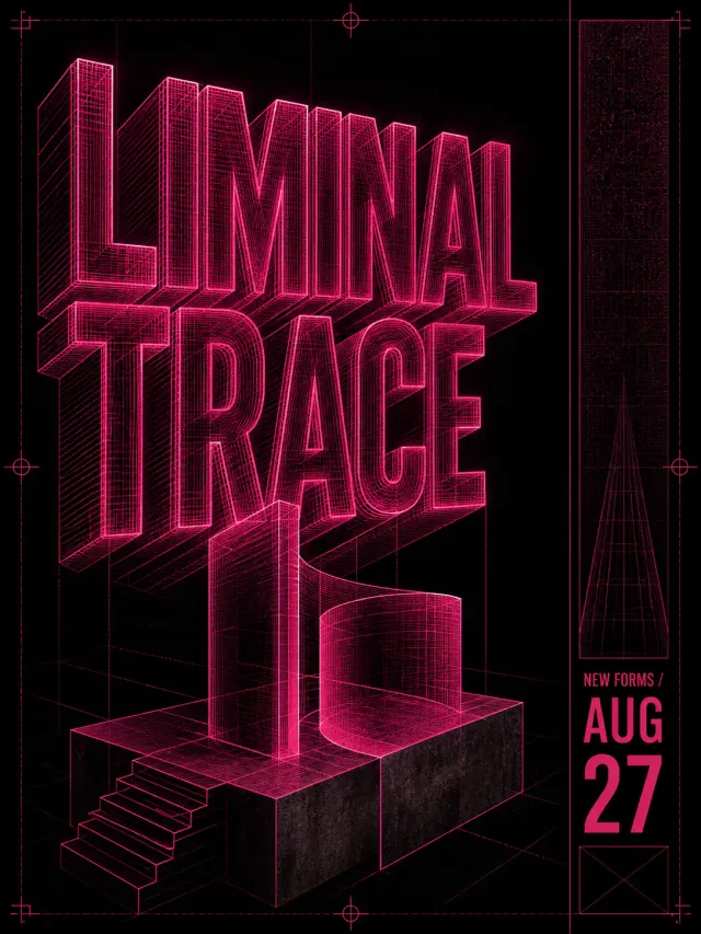
Use case: ads-marketing Asset type: experimental typographic poster Primary request: design a polished poster for a contemporary design exhibition. Subject: an abstract gallery object, registration marks, and a slim date column. Style/medium: contemporary graphic design with deconstructed typography and crisp print-quality detail. Composition/framing: 3:4 canvas; large letterforms treated as translucent, extruded, folded, or luminous physical objects within a sparse poster field; build a spatial composition with depth, perspective, extrusion, or layered planes while keeping the headline readable. Typography: material lighting and depth define the typography while the silhouette remains legible. Render the headline "LIMINAL TRACE" exactly once and the secondary line "NEW FORMS / AUG 27" exactly once. Color palette: black, white, and saturated magenta. Constraints: readable headline, deliberate hierarchy, clean edges, balanced negative space, no extra words, no logos, no trademarks, no watermark.
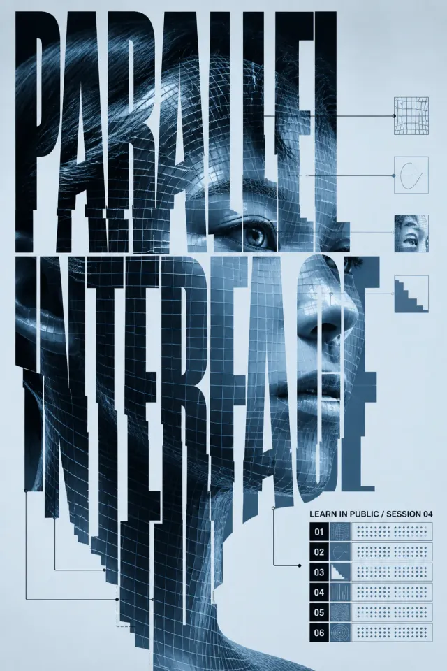
Use case: ads-marketing Asset type: experimental typographic poster Primary request: design a polished poster for an open learning festival. Subject: a diagram fragment, annotation lines, and a modular lesson index. Style/medium: contemporary graphic design with deconstructed typography and crisp print-quality detail. Composition/framing: 2:3 canvas; photographic material cropped into letter apertures or fragmented into bands that interlock with oversized typography; reduce the composition to one main typographic gesture, strong negative space, and one compact information cluster. Typography: image and text share one silhouette rather than behaving as separate layers. Render the headline "PARALLEL INTERFACE" exactly once and the secondary line "LEARN IN PUBLIC / SESSION 04" exactly once. Color palette: blue-black, ice blue, and chrome gray. Constraints: readable headline, deliberate hierarchy, clean edges, balanced negative space, no extra words, no logos, no trademarks, no watermark.
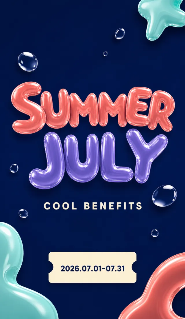
Create a brand-new English summer monthly event vertical poster. Accurately present the text “SUMMER JULY”“COOL BENEFITS”“2026.07.01-07.31”. Use deep navy blue, coral orange, mint green, cream white, and violet. Employ glossy, water-like balloon lettering and floating transparent water droplets. Center the title and add a simple call-to-action coupon button at the bottom. Adopt a sophisticated, clean 3D graphic style with ample negative space. Do not include clinic names, brands, logos, website URLs, QR codes, watermarks, or tiny text. Output a high-quality static PNG.

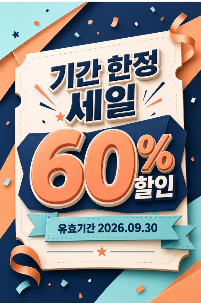
Create a new original coupon or sale design: high-impact seasonal sale poster with dimensional display lettering, layered paper shapes, confetti, and a clear central offer. Style: clean commercial graphic, polished and print-ready, with harmonious navy, apricot, and pale aqua. Layout: Vertical poster composition preserving the source-like hierarchy of headline, large value, supporting line, and date while using entirely new shapes and spacing. Main text exactly: "기간 한정 세일", "60% 할인", "유효기간 2026.09.30". Language: Korean and English; keep that language and script only, preserve its natural typographic hierarchy, and do not translate. Design changes: use a different dominant palette, rearrange icons and patterns, and redesign borders, corners, perforations, shadows, gradients, and decorative angles. Background: Use a newly colored commercial backdrop with no copied texture or decoration. Remove every brand, store or platform name, logo, watermark, website, QR code, author mark, barcode, and any note beginning with "*". Avoid exact copying, original colors, copyrighted elements, random text, tiny unreadable legal text, misspellings, fake logos, and scannable codes.

Use case: ads-marketing Asset type: experimental typographic poster Primary request: design a polished poster for an open learning festival. Subject: a diagram fragment, annotation lines, and a modular lesson index. Style/medium: contemporary graphic design with deconstructed typography and crisp print-quality detail. Composition/framing: 3:4 canvas; large letterforms treated as translucent, extruded, folded, or luminous physical objects within a sparse poster field; organize the typography with a strong primary mass, measured secondary information, clear negative space, and one decisive directional rhythm. Typography: material lighting and depth define the typography while the silhouette remains legible. Render the headline "LIMINAL VOLUME" exactly once and the secondary line "LEARN IN PUBLIC / SESSION 04" exactly once. Color palette: graphite gray, acid green, and clean white. Constraints: readable headline, deliberate hierarchy, clean edges, balanced negative space, no extra words, no logos, no trademarks, no watermark.