Mockup Display Creative Inspiration

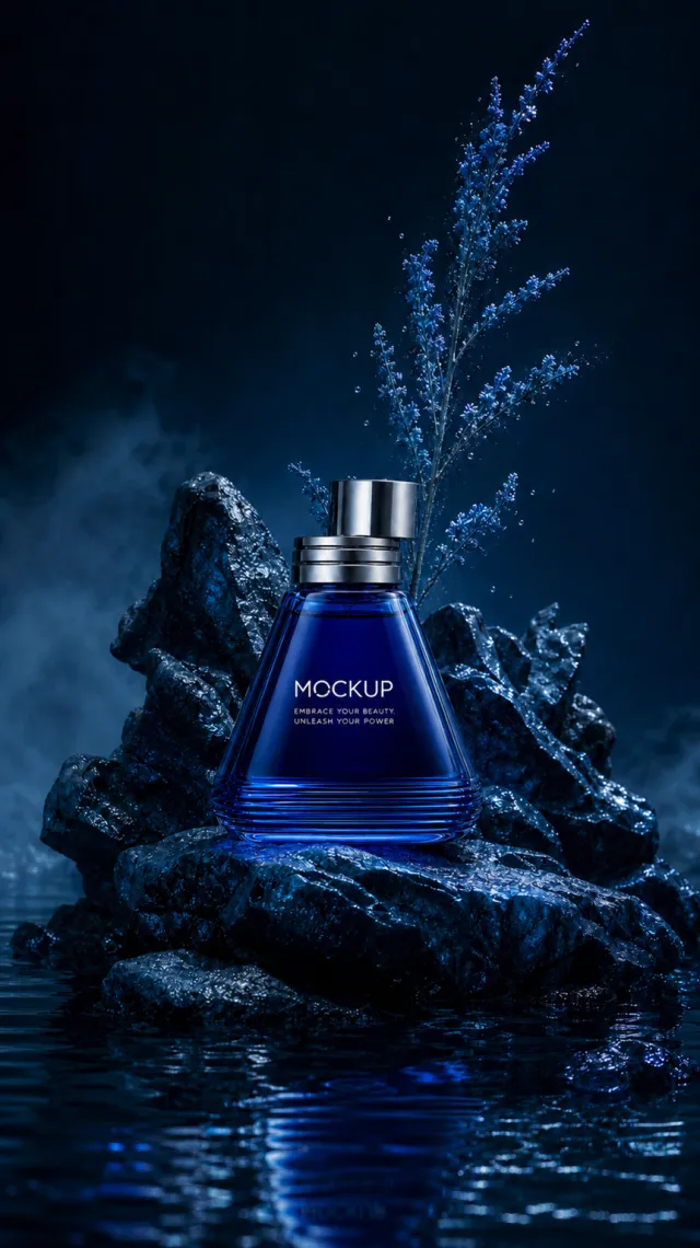
Use case: ads-marketing / product-mockup Asset type: very tall nocturnal aquatic fragrance poster, approximately 9:16 Input images: Image 1 is the authoritative product identity reference. Use exactly this bottle without redesigning it. Place the exact cobalt bottle from Image 1 upright on a newly arranged asymmetrical pedestal of jagged wet cobalt rocks. Add shallow reflective water below, midnight-blue mist, and one slender plume of blue sea-lavender with fine droplets rising behind the product. Preserve the bottle exactly: low tapered triangular cobalt-glass body, rounded corners, horizontal ribbing near the base, thick clear blue edge, brushed-silver stepped collar, short offset cylindrical silver cap, proportions, front-facing angle, and label placement. Preserve the text verbatim: "MOCKUP" and "EMBRACE YOUR BEAUTY, UNLEASH YOUR POWER". No other text. Style: high-end photorealistic fragrance advertising with realistic wet rock, glass, reflections, mist, droplets, and plants. Composition: very tall vertical frame, product centered in the lower-middle, botanical plume above, water foreground. Lighting: cool moonlit rim lighting with luminous blue highlights. Palette: midnight blue, cobalt, indigo, silver, cool cyan. Constraints: exactly one bottle; no people; no poster copy; no extra logo; no watermark; keep the product identical and label fully readable.
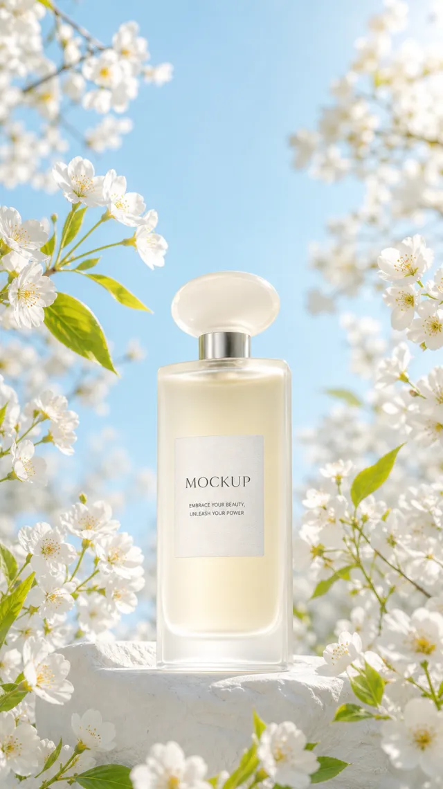
以参考图为唯一且权威的产品参考,生成一张清新春日氛围的高端香水海报。 - 产品必须完全一致:高挑柔角长方形磨砂象牙色玻璃瓶、厚透明底座、浅香槟色液体、短银色瓶颈、半透明乳白椭圆雕塑感瓶盖,以及象牙色纹理标签上的 `MOCKUP` 和 `EMBRACE YOUR BEAUTY, UNLEASH YOUR POWER`。 - 不得改变瓶型、比例、材质、瓶盖、标签内容、字体层级和位置。 - 场景为淡天蓝色春日背景,产品立于白色石质台座上,周围由白色春花枝条和少量嫩绿叶片自然环绕,花枝不能遮挡产品。 - 使用干净自然日光、珠光高光与柔和阴影,呈现通透、优雅的商业摄影质感。 - 去除水印、原图文字和促销信息;除产品标签外,不添加任何文字或标志。

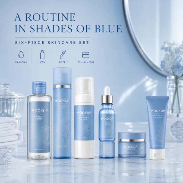
【Output Rules | Do Not Display】 Generate only one 1000×1000, 1:1 Amazon Listing secondary image. No collage images, six-grid layouts, multi-card grids, or multiple scenes are allowed. 【Sharing Rules】 Use the provided product reference image as the sole basis for the product. Product: six-piece blue skincare set. Copywriting must be in English, and brand placeholders should use MOCKUP only. Visuals should follow high-end commercial e-commerce photography standards—clear imagery, distinct layering, and concise, easy-to-read copy. The product’s appearance, structure, colors, quantity, accessories, and relative proportions must match the reference image; products, people, icons, and props must maintain natural proportions. All essential information must remain within the safe area, with the background extending fully to all four edges. External white borders, vertical borders on left and right, transparent fill-in borders, watermarks, contact information, social media accounts, platform details, original brand logos, gibberish, irrelevant information, or unverified claims are prohibited. Headlines must not appear. 【Image Composition】 Create a premium square 1000×1000 listing image featuring the clean six-piece blue skincare set. If necessary, use entirely new scenes and new people or animals, ensuring natural anatomy and accurate product proportions. Exact copy separated by vertical bars: A ROUTINE IN SHADES OF BLUE | SIX-PIECE SKINCARE SET | CLEANSE | TONE | LAYER | MOISTURIZE. Keep MOCKUP legible and text within safe margins. Do not include any unverified claims regarding medical benefits, safety, performance, certifications, material origins, warranties, compatibility, or other such assertions.

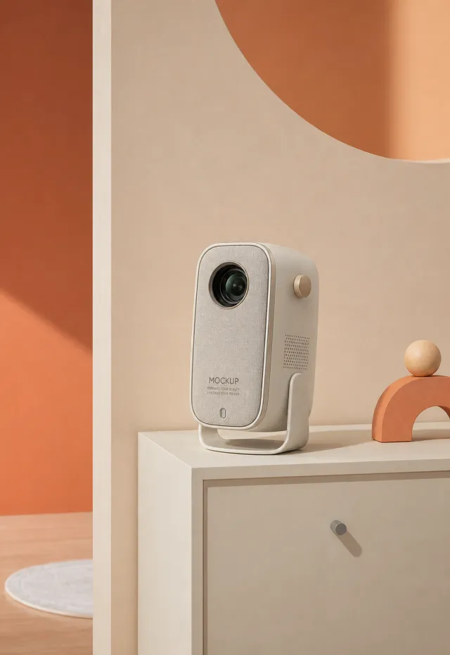
Use the supplied reference image as the sole locked product input. Preserve the product's exact appearance, structure, materials, colors, proportions, logo, label, accessories, and product-set relationship. Create a 130:189 photorealistic commercial product poster. Place the single cream security camera upright on a small cabinet in a playful cream-and-peach room. Use large geometric wall shapes, minimal decorative objects, soft daylight, and clean front-three-quarter framing. Use a polished premium advertising finish with crisp product focus, coherent perspective, realistic materials, controlled depth of field, and physically plausible lighting. Keep all decorative elements physically plausible and subordinate to the product. Keep existing product text legible when present. No poster text, watermark, extra product, unrelated logo, distorted object, changed product appearance, or unnecessary person.

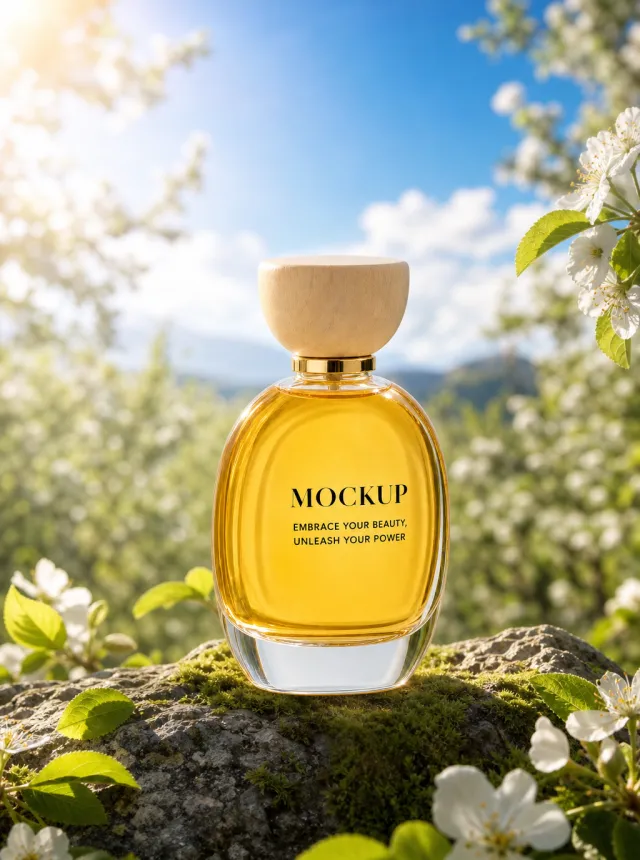
Use the supplied reference image as the sole locked product input. Preserve the product's exact appearance, structure, materials, colors, proportions, logo, label, accessories, and product-set relationship. Create a 3:4 photorealistic commercial product poster. Place the single amber perfume bottle upright on a moss-covered rock in a sunlit spring orchard. Surround it with white blossoms, fresh green leaves, soft clouds, and a vivid blue sky, using bright natural backlight and shallow depth of field. Use a polished premium advertising finish with crisp product focus, coherent perspective, realistic materials, controlled depth of field, and physically plausible lighting. Keep all decorative elements physically plausible and subordinate to the product. Keep existing product text legible when present. No poster text, watermark, extra product, unrelated logo, distorted object, changed product appearance, or unnecessary person.

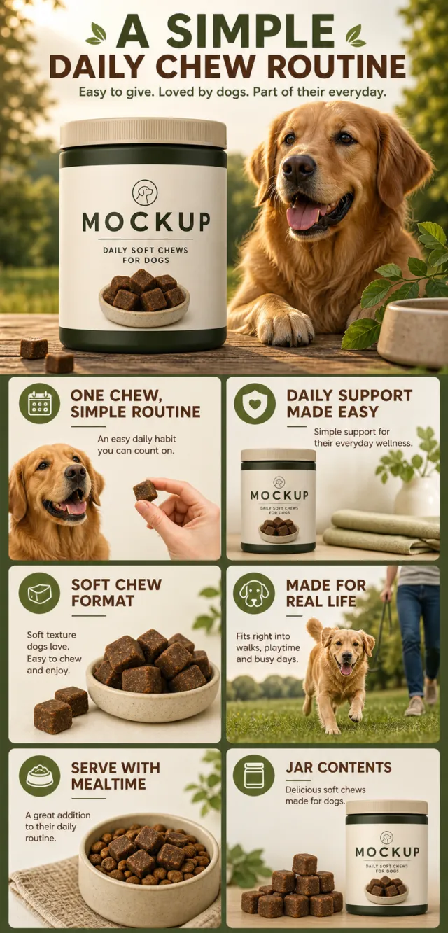
【Execution Route | Must Not Appear on Screen】 If the image-generation tool can be invoked multiple times: concatenate the sharing rules with A–F separately, and execute six times; each time, generate only one 1000×1000 square image. If only a single image can be generated at a time: first set the interface/API to a 2:3 portrait orientation and do not use Auto; then generate a 2-column × 3-row grid labeled A/B, C/D, and E/F. All six cells must be equal in size, with a visual ratio of 1:1. The outer canvas must not be 1:1. 【Sharing Rules】 The provided product reference image serves as the sole basis for the product’s appearance, structure, color, quantity, accessories, and relative proportions. The product is a dark olive-green daily soft-chew nutritional jar for dogs, featuring a beige screw cap and label, with the front showcasing a bowl of brown, square-shaped soft chews. The visual style employs natural outdoor pet nutrition tones—deep green, cream, and warm brown—with friendly English typography and realistic golden daylight. Products, people, animals, text, icons, and props must maintain their natural proportions; stretching or independent scaling is prohibited. All essential information must remain within the safe zone, while the background extends fully across all four edges. Only MOCKUP may be used for branding. Remove any surrounding white borders, vertical sidebars, numbered corner marks, watermarks, contact details, social media accounts, original brand logos, platform information, gibberish, distorted limbs, and irrelevant content. People and animals must be recreated from scratch. Copy should be concise, readable, and trustworthy; A–F are purely control markers and must not appear on screen. 【A | Core Selling Point】Title: “ONE CHEW, SIMPLE ROUTINE.” Show the nutritional jar alongside a newly created happy adult dog, emphasizing simple everyday support without making therapeutic claims. 【B | Everyday Support】Title: “DAILY SUPPORT MADE EASY.” Use four clean icons to represent coat health, vitality, activity, and digestion, with restrained yet credible copy. 【C | Soft Chew Format】Title: “SOFT CHEW FORMAT.” Close-up shots of the soft chews and small bowl highlight the square texture and easy-to-use format. 【D | Real-Life Scene】Title: “MADE FOR REAL LIFE.” After an outdoor walk, the owner naturally hands over a chew, with the full jar prominently displayed in the foreground. 【E | Usage Instructions】Title: “SERVE WITH MEALTIME.” No three-part numerical sequence—open, take out, serve alongside the regular meal. 【F | Product Overview】Title: “JAR CONTENTS.” Neatly arrange the nutritional jar, its open lid, and the soft chews, without exaggerating the quantity.

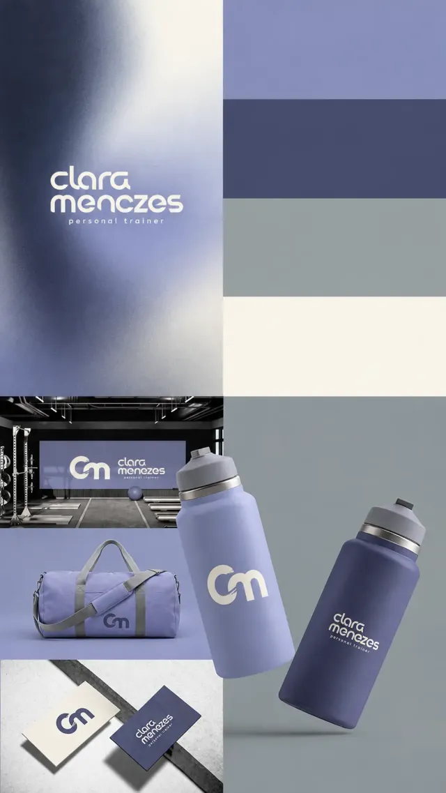
9:16竖幅私人教练品牌展示。上半左列为靛蓝、长春花紫、冷灰和象牙白模糊颗粒渐变,居中奶白圆润几何小写两行clara、menezes,下面疏排personal trainer。右上四条色块依次浅长春花紫、靛蓝、冷灰、象牙白。左下三幅:现代健身房,紫色墙板印cm和姓名;紫色运动旅行袋,灰色织带和深靛蓝cm;浅石面上两张奶白与靛蓝名片,分别印cm和品牌。右下冷灰背景,两只哑光运动水壶悬浮倾斜,前方浅紫壶跨越中线,印大奶白cm,后方深靛蓝壶印clara menezes personal trainer,均为灰色壶盖和细银色环。cm由开口圆弧c与圆润m连接并有切角细节。柔和阴影、布纹和喷涂材质细腻。

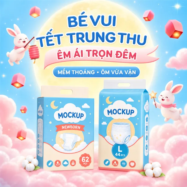
【Output Rules | Do Not Display】 Generate only one 1000×1000, 1:1 Amazon Listing secondary image. No collages, six-grid layouts, multi-card grids, or multiple images are allowed. 【Sharing Rules】 Use the provided product reference image as the sole basis for the product. Product: two-pack baby diapers. Copywriting must be in Vietnamese; brand placeholders should use MOCKUP only. Visuals should follow high-end commercial e-commerce photography standards—sharp imagery, clear hierarchy, and concise, easy-to-read copy. The product’s appearance, structure, colors, quantity, accessories, and relative proportions must match the reference image exactly; products, people, icons, and props must maintain natural proportions. All essential information must remain within the safe zone, with the background extending fully to all four edges. External white borders, vertical borders on left and right, transparent edge fills, watermarks, contact details, social media accounts, platform information, original branding, gibberish, irrelevant content, or unverified claims regarding efficacy or specifications are prohibited. Headlines must not be displayed. 【Image Composition】 Place both packages on a pink cloud beneath a moon adorned with illustrated moon rabbits and lantern cubes. Use the exact copy: "B脢 VUI T岷綯 TRUNG THU", "脢M 脕I TR峄孨 膼脢M", "M峄€M THO脕NG • 脭M V峄狝 V岷禢". Employ sky blue, cotton pink, and moon yellow tones. Ensure the packages appear complete and natural.

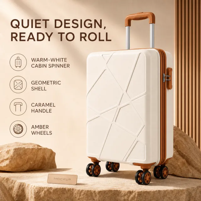
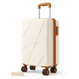
【Output Rules | Do Not Display】 Generate only one 1000×1000, 1:1 Amazon Listing secondary image. No collages, six-grid layouts, multi-card grids, or multiple images are allowed. 【Sharing Rules】 Use the provided product reference image as the sole product basis. Product: warm-white geometric cabin suitcase. Copywriting must be in English, and brand placeholders should use MOCKUP only. Visuals should follow high-end commercial e-commerce photography standards—clear imagery, distinct layering, and concise, easy-to-read copy. The product’s appearance, structure, color, quantity, accessories, and relative proportions must match the reference image; products, people, icons, and props must maintain natural proportions. All essential information must remain within the safe zone, with the background extending fully to all four edges. External white borders, vertical borders on left and right, transparent edge fillers, watermarks, contact information, social media accounts, platform details, original branding, gibberish, irrelevant content, or unverified claims are prohibited. Headlines must not appear. 【Image Composition】 Create a premium square 1000×1000 listing image featuring the clean warm-white geometric cabin suitcase. If necessary, use entirely new scenes and new people or animals, ensuring natural anatomy and accurate product proportions. Exact copy separated by vertical bars: QUIET DESIGN, READY TO ROLL | WARM-WHITE CABIN SPINNER | GEOMETRIC SHELL | CARAMEL HANDLE | AMBER WHEELS. Keep MOCKUP legible and ensure all text remains within safe margins. Do not include medical, safety, performance, certification, material origin, warranty, or other unverified claims.

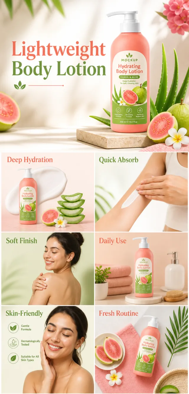
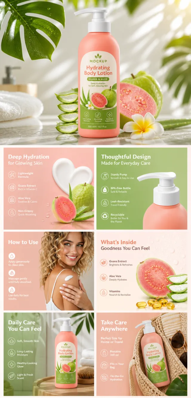
【Execution Routing | Do Not Display】 If the image-generation tool can be invoked multiple times: concatenate the sharing rules with A–F separately, execute six times, generating one 1000×1000 square image each time; do not submit all modules at once. If only one image can be generated per run: set the interface or API to a 2:3 portrait orientation and disable Auto; a recommended size is 1200×1800. Arrange A/B, C/D, and E/F into a 2-column × 3-row grid of six modules, ensuring equal module sizes and maintaining a 1:1 aspect ratio. If the platform enforces a 1:1 ratio, switch to using an Agent or generate each module individually. 【Sharing Rules】 The provided product reference image serves as the sole product basis. Product: hydrating body lotion. Copywriting must be in English, with brand placeholders replaced by MOCKUP only. Visuals should incorporate coral pink, guava, leaf green, and cream. The product’s appearance, structure, color, quantity, accessories, and relative proportions must match the reference image; product, figures, icons, and props must maintain natural proportions. All essential information must remain within the safe zone, with the background extending fully to all four edges. External white borders, vertical borders on left and right, transparent padding, watermarks, contact details, social media accounts, platform information, original branding, garbled text, irrelevant content, or unverified claims regarding efficacy or specifications are prohibited. Headlines must not be displayed. A–F must not appear. 【A | Theme】Copy: “Lightweight Body Lotion”; focus on conveying the core value through the complete main visual of the product. 【B | Theme】Copy: “Deep Hydration”; design an independent square image around this theme, avoiding overlapping selling points, compositions, and product angles with other modules. 【C | Theme】Copy: “Quick Absorb”; design an independent square image centered on this theme, ensuring no overlap in selling points, composition, or product perspective with other modules. 【D | Theme】Copy: “Soft Finish”; create an independent square image revolving around this theme, while avoiding duplicate selling points, compositions, and product angles compared to other modules. 【E | Theme】Copy: “Daily Use”; develop an independent square image based on this theme, ensuring no repetition of selling points, compositions, or product perspectives with other modules. 【F | Theme】Copy: “Skin-Friendly” and “Fresh Routine”; design separate square images for these themes, avoiding overlapping selling points, compositions, and product angles with other modules.

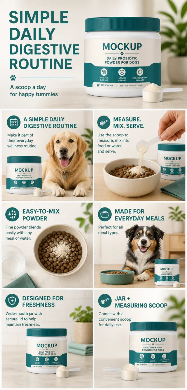
【Execution Route | Must Not Appear on Screen】 If the image-generation tool can be invoked multiple times: concatenate the sharing rules with A–F separately, and execute six times; each time, generate only one 1000×1000 square image. If only a single image can be generated at a time: first set the interface/API to a 2:3 portrait orientation and do not use Auto; then arrange images in a 2-column × 3-row grid labeled A/B, C/D, and E/F. All six cells must be equal in size, with a visual aspect ratio of 1:1. The outer canvas must not be 1:1. 【Sharing Rules】 Use the provided product reference image as the sole basis for product appearance, structure, color, quantity, accessories, and relative proportions. The product is a white, wide-mouthed probiotic powder canister for dogs, featuring a dark teal striped lid, cream-and-teal green labels, and a transparent measuring spoon containing light-colored powder. The visual style employs clean pet nutrition graphics in white, dark teal, and soft beige, combined with modern English typography and bright lifestyle photography. Maintain natural proportions for products, people, animals, text, icons, and props—no stretching or independent scaling allowed. Ensure all essential information remains within the safe zone, with the background extending fully across all four edges. Use MOCKUP exclusively for branding. Remove any peripheral white borders, vertical sidebars, numbered corner marks, watermarks, contact details, social media accounts, original brand logos, platform information, gibberish, distorted body parts, and irrelevant content. People and animals must be recreated from scratch. Copy should be concise, readable, and trustworthy; A–F are solely control markers and must not appear on screen. 【A | Core Selling Point】Title: “A SIMPLE DAILY DIGESTIVE ROUTINE.” Feature a hero shot of the canister and measuring spoon, accompanied by credible language emphasizing everyday digestive support—without making therapeutic claims. 【B | Usage Instructions】Title: “MEASURE. MIX. SERVE.” Present three non-numeric scenes: measure the powder, mix it into food, and serve it to your dog. 【C | Powder Form】Title: “EASY-TO-MIX POWDER.” Close-up shots of the powder and measuring spoon highlight its fine texture and easy mixing. 【D | Everyday Scene】Title: “MADE FOR EVERYDAY MEALS.” Newly created imagery shows a dog owner adding the powder to their pet’s bowl in a bright kitchen. 【E | Packaging Details】Title: “DESIGNED FOR FRESHNESS.” Close-ups of the wide-mouth canister, striped screw-on lid, sealing edge, and label, focusing only on visible structural elements. 【F | Package Contents】Title: “JAR + MEASURING SCOOP.” Neatly arranged canister, measuring spoon, and a small amount of powder, with accurate quantities displayed.

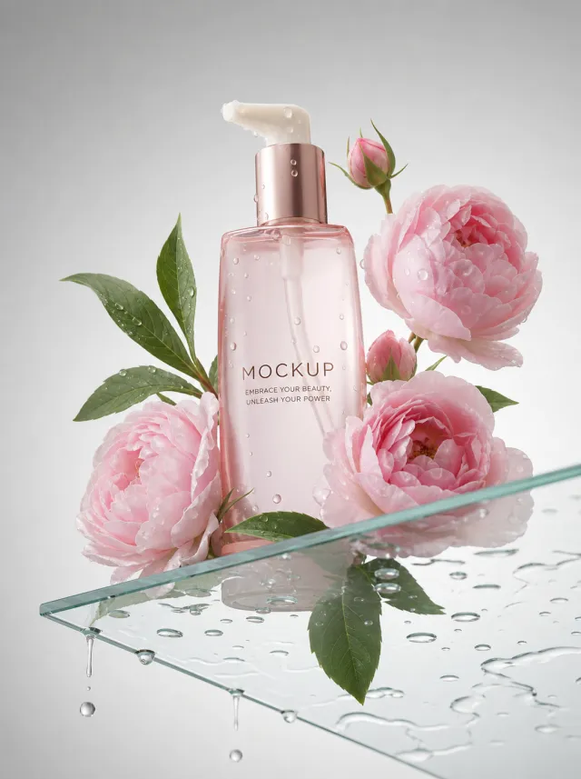
Use the supplied reference image as the sole locked product input. Preserve the product's exact appearance, structure, materials, colors, proportions, logo, label, accessories, and product-set relationship. Create a 1084:1451 photorealistic commercial product poster. Place the single pale pink pump bottle upright on a transparent glass shelf covered with water droplets. Frame it with fresh pink peonies and green leaves against a clean light-gray background, using high-key soft light and delicate reflections. Use a polished premium advertising finish with crisp product focus, coherent perspective, realistic materials, controlled depth of field, and physically plausible lighting. Keep all decorative elements physically plausible and subordinate to the product. Keep existing product text legible when present. No poster text, watermark, extra product, unrelated logo, distorted object, changed product appearance, or unnecessary person.

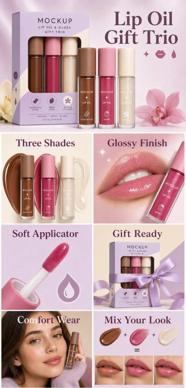
【Execution Routing | Do Not Display】 If the image-generation tool can be invoked multiple times: concatenate the sharing rules with A–F separately, execute six times, generating one 1000×1000 square image each time; do not submit all modules at once. If only one image can be generated per invocation: set the interface or API to a 2:3 portrait orientation and disable Auto mode; a recommended size is 1200×1800. Arrange A/B, C/D, and E/F into a 2-column × 3-row grid of six modules, ensuring equal module sizes and maintaining a 1:1 aspect ratio. If the platform enforces a 1:1 ratio, switch to using an Agent or generate each module individually. 【Sharing Rules】 The provided product reference image serves as the sole basis for the product. Product: lip oil and gloss gift trio. Copywriting must be in English, with brand placeholders replaced by MOCKUP only. Visuals should incorporate lilac, cocoa, berry pink, and cream. The product’s appearance, structure, colors, quantity, accessories, and relative proportions must match the reference image; products, figures, icons, and props must maintain natural proportions. All essential information must remain within the safe zone, with the background extending fully to all four edges. External white borders, vertical borders on left and right, transparent fill-in borders, watermarks, contact details, social media accounts, platform information, original branding, garbled text, irrelevant information, or unverified claims regarding efficacy or specifications are prohibited. Headlines must not be displayed. A–F must not appear. 【A | Theme】Copy: “Lip Oil Gift Trio”; focus on the complete product main visual to convey core value. 【B | Theme】Copy: “Three Shades”; design an independent square image around this theme, ensuring no overlap in selling points, composition, or product angles with other modules. 【C | Theme】Copy: “Glossy Finish”; design an independent square image around this theme, avoiding overlaps in selling points, composition, and product angles with other modules. 【D | Theme】Copy: “Soft Applicator”; design an independent square image around this theme, avoiding overlaps in selling points, composition, and product angles with other modules. 【E | Theme】Copy: “Gift Ready”; design an independent square image around this theme, avoiding overlaps in selling points, composition, and product angles with other modules. 【F | Theme】Copy: “Comfort Wear” and “Mix Your Look”; design independent square images around these themes, avoiding overlaps in selling points, composition, and product angles with other modules.

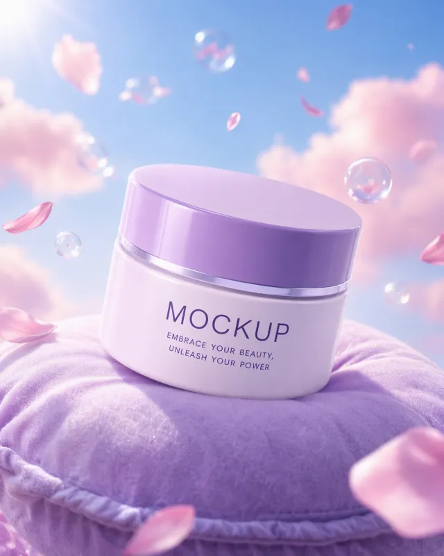
Use the supplied reference image as the sole locked product input. Preserve the product's exact appearance, structure, materials, colors, proportions, logo, label, accessories, and product-set relationship. Create a 561:701 photorealistic commercial product poster. Place the single lavender cream jar at a slight angle on a plush lavender cushion floating in a cyan sky. Add soft pink clouds, drifting petals, clear bubbles, and luminous whimsical daylight. Use a polished premium advertising finish with crisp product focus, coherent perspective, realistic materials, controlled depth of field, and physically plausible lighting. Keep all decorative elements physically plausible and subordinate to the product. Keep existing product text legible when present. No poster text, watermark, extra product, unrelated logo, distorted object, changed product appearance, or unnecessary person.

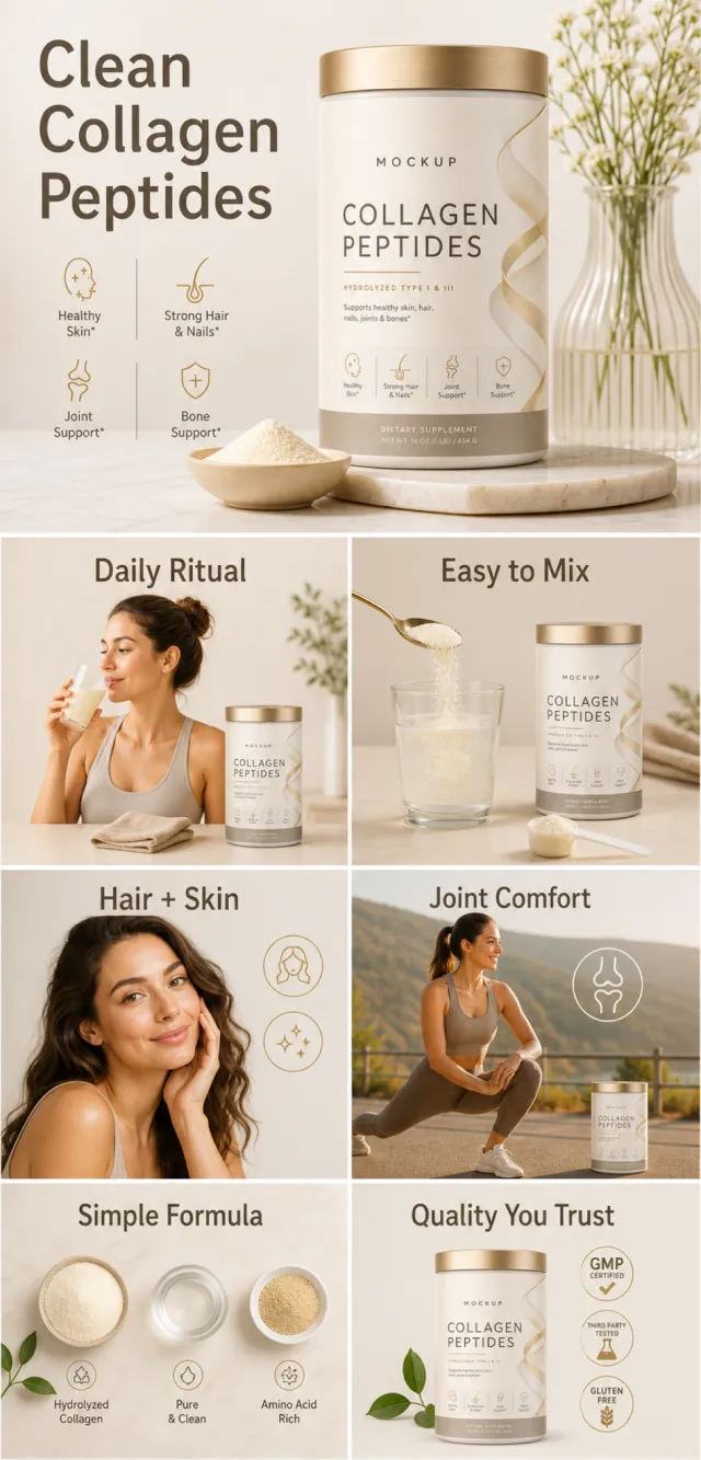
【Execution Routing | Do Not Display】 If the image-generation tool can be invoked multiple times: concatenate the sharing rules with A–F separately, execute six times, generating one 1000×1000 square image each time; do not submit all modules at once. If only one image can be generated per run: set the interface or API to a 2:3 portrait orientation and disable Auto mode; a recommended size is 1200×1800. Arrange A/B, C/D, and E/F into a 2-column × 3-row grid of six modules, ensuring equal module sizes and maintaining a 1:1 aspect ratio. If the platform enforces a 1:1 ratio, switch to using an Agent or generate each module individually. 【Sharing Rules】 Use the provided product reference image as the sole product basis. Product: collagen peptide powder. Copywriting must be in English, with brand placeholders replaced by MOCKUP only. Visuals should incorporate cream, taupe, soft gold, and warm gray. The product’s appearance, structure, color, quantity, accessories, and relative proportions must match the reference image; products, figures, icons, and props should maintain natural proportions. All essential information must remain within the safe zone, with the background extending fully across all four edges. Prohibit outer white borders, vertical sidebars, transparent fill-in borders, watermarks, contact details, social media accounts, platform information, original branding, gibberish, irrelevant content, or unverified claims regarding efficacy or specifications; ensure that titles are not displayed. A–F must not appear. 【A|Theme】Copy: “Clean Collagen Peptides”; focus on conveying the core value through the full product main visual. 【B|Theme】Copy: “Daily Ritual”; design an independent square image around this theme, avoiding overlapping selling points, compositions, and product angles with other modules. 【C|Theme】Copy: “Easy to Mix”; design an independent square image around this theme, avoiding overlapping selling points, compositions, and product angles with other modules. 【D|Theme】Copy: “Hair + Skin”; design an independent square image around this theme, avoiding overlapping selling points, compositions, and product angles with other modules. 【E|Theme】Copy: “Joint Comfort”; design an independent square image around this theme, avoiding overlapping selling points, compositions, and product angles with other modules. 【F|Theme】Copy: “Simple Formula” and “Quality You Trust”; design independent square images around these themes, avoiding overlapping selling points, compositions, and product angles with other modules.

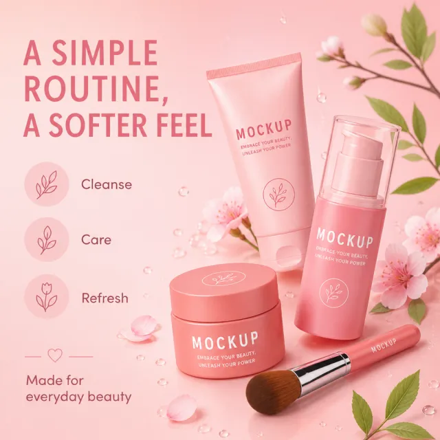
Create ONE independent Amazon listing image. Use a 1:1 square 1000x1000 px canvas with a full-bleed composition, no white border, no side bars, no collage, and no multi-panel layout. Use the visual reference only for composition, camera angle, lighting, color mood, scene, typography hierarchy, and information structure. Do not copy its original wording or graphic assets. Use the provided white-background product image as the sole product source. Preserve its exact silhouette, geometry, parts, materials, colors, proportions, controls, labels, connectors, and accessory count. Keep the product complete, naturally assembled, and undistorted. Do not replace, merge, stretch, crop, or redesign the product. Do not show cutaway, exploded, anatomical, or internal views. Preserve any approved MOCKUP identity already present on the product image, but do not copy brands or logos from the visual reference. Rewrite all visible copy in English with fresh, plausible, category-appropriate wording. Do not reuse the visual reference's original brand names, phrases, statistics, certifications, filenames, or source graphics. Avoid unsupported medical, legal, safety, or absolute claims. Do not include Chinese or mixed-language instructions. Do not include execution-mode notes, source names, file paths, reconstruction history, or metadata. Keep all typography legible and inside the canvas. Create a soft pink skincare still life using the complete set from the product image, with botanical accents and a calm beauty layout. Use fresh copy such as “A SIMPLE ROUTINE, A SOFTER FEEL”, “Cleanse”, “Care”, “Refresh”, and “Made for everyday beauty”.

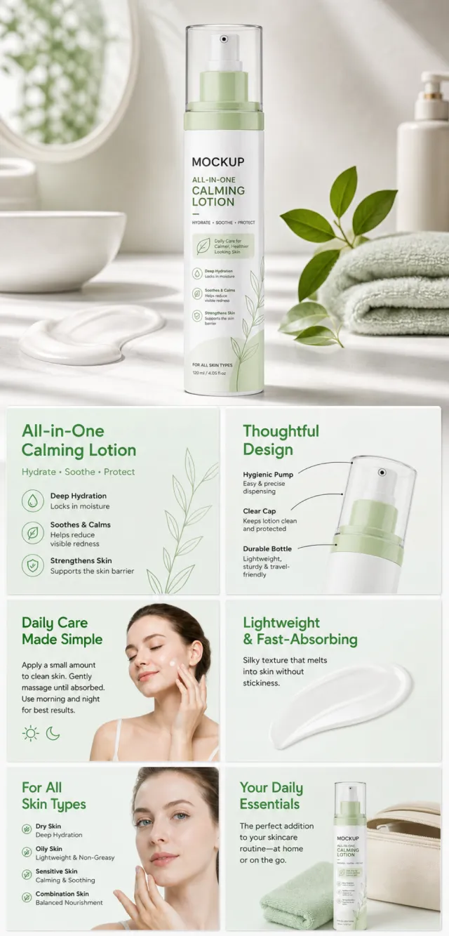
【Execution Route | Must Not Appear on Screen】 If the image-generation tool can be invoked multiple times: concatenate the sharing rules with A–F separately and execute six times; each time, generate only one independent 1000×1000 square image, resulting in six sub-images. If only single‑shot generation is allowed: use a 2:3 vertical canvas measuring 1200×2500, with the top approximately 30% reserved for the product’s main visual integrated into the background, and arrange the remaining area into a 2‑column × 3‑row grid labeled A/B, C/D, and E/F. All six cards should be equal in size, with an aspect ratio close to 1:1. Do not use a 1:1 outer canvas, nor full‑width cards, cross‑column cards, merged cards, borders, frames, or white margins. 【Sharing Rules】 The provided product reference image serves as the sole basis for the product’s appearance, structure, color, quantity, accessories, and relative proportions. Product orientation: a soothing, moisturizing pump bottle in white and teal; intended for bathroom use, with a lotion‑like texture, offering light hydration suitable for daily application. The product itself, along with any newly generated characters, animals, props, or text, must maintain natural proportions—stretching, flattening, or non‑uniform scaling is prohibited—and the background must extend fully across all four edges. Branding must uniformly follow the MOCKUP style; remove original branding, logos, watermarks, contact information, social media handles, platform details, gibberish, and irrelevant content. Copy should be concise, clear, and credible, retaining the language of the reference image, without adding unsubstantiated absolute claims or medical promises. Labels A–F are purely control markers and must not appear on screen. 【A | Core Selling Point】 Highlight the product’s most important value and its complete main subject; keep the headline short and clear. 【B | Structure and Materials】 Showcase key structural elements, materials, or components using close‑up shots or simple annotations, adhering to the product’s designated orientation. 【C | Real‑World Use】 Generate natural scenes featuring people, animals, or everyday settings to demonstrate realistic usage, ensuring proportions and actions appear believable. 【D | Details and Steps】 Use close‑ups, step‑by‑step instructions, or flowcharts to explain operations, textures, interfaces, storage solutions, or care details. 【E | Lifestyle】 Illustrate how the product seamlessly integrates into family life, commuting, outdoor activities, travel, or work scenarios. 【F | Sets and Portability】 Accurately depict the product, its accessories, quantities, and storage relationships; do not add any components absent from the reference image.
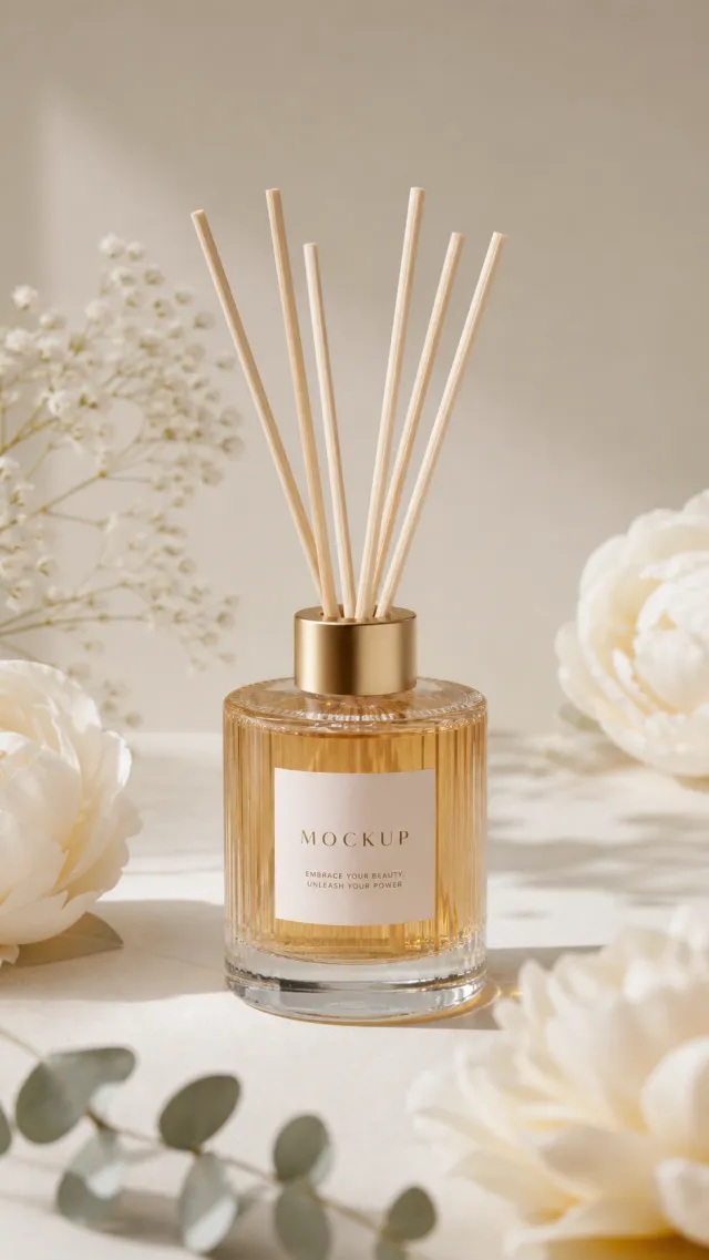
Use the supplied reference image as the sole locked product input. Preserve the product's exact appearance, structure, materials, colors, proportions, logo, label, accessories, and product-set relationship. Create a 941:1672 photorealistic commercial product poster. Place the single golden reed diffuser upright on white marble among white peonies and eucalyptus leaves. Use high-key daylight, soft floral shadows, and refined transparent-glass highlights. Use a polished premium advertising finish with crisp product focus, coherent perspective, realistic materials, controlled depth of field, and physically plausible lighting. Keep all decorative elements physically plausible and subordinate to the product. Keep existing product text legible when present. No poster text, watermark, extra product, unrelated logo, distorted object, changed product appearance, or unnecessary person.

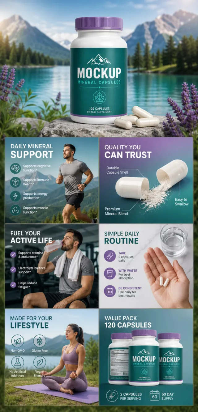
【Execution Route | Must Not Appear on Screen】 If the image-generation tool can be invoked multiple times: concatenate the sharing rules with A–F separately and execute six times; each time, generate only one independent 1000×1000 square image, resulting in six sub-images. If only a single generation is allowed: use a 2:3 vertical canvas measuring 1200×2500, with approximately 30% at the top reserved for the product’s main visual integrated into the background, and arrange the remaining area into a 2-column × 3-row grid labeled A/B, C/D, and E/F. All six cards should be of equal size, with an aspect ratio close to 1:1. Do not use a 1:1 outer canvas, nor full-width cards, cross-column cards, merged cards, borders, frames, or white margins. 【Sharing Rules】 The provided product reference image serves as the sole basis for the product’s appearance, structure, color, quantity, accessories, and relative proportions. Product orientation: white mineral capsule bottle, purple cap, purple‑blue label, and white capsules; refreshing everyday nutrition. The product itself, along with any newly generated characters, animals, props, or text, must maintain natural proportions—stretching, flattening, or non‑uniform scaling is prohibited—and the background must extend fully across all four edges. The brand must uniformly use MOCKUP; remove original branding, logos, watermarks, contact information, social media accounts, platform details, gibberish, and irrelevant content. Copywriting should be concise, clear, and credible, retaining the language of the reference image without adding unsupported absolute claims or medical promises. A–F are merely control markers and must not appear on screen. 【A | Core Selling Point】 Highlight the product’s most important value and its complete main subject; keep the title short and clear. 【B | Structure and Materials】 Showcase key structural elements, materials, or components using close-up shots or simple annotations, adhering to the product’s designated orientation. 【C | Real‑World Use】 Generate natural scenes featuring people, animals, or everyday life to demonstrate realistic usage, ensuring proportions and actions appear believable. 【D | Details and Steps】 Use close-ups, step-by-step instructions, or flowcharts to explain operations, textures, interfaces, storage solutions, or care details. 【E | Lifestyle】 Illustrate how the product seamlessly integrates into daily routines—whether at home, during commutes, outdoors, while traveling, or at work. 【F | Sets and Portability】 Accurately depict the product, its accessories, quantities, and storage relationships; do not add any components absent from the reference image.
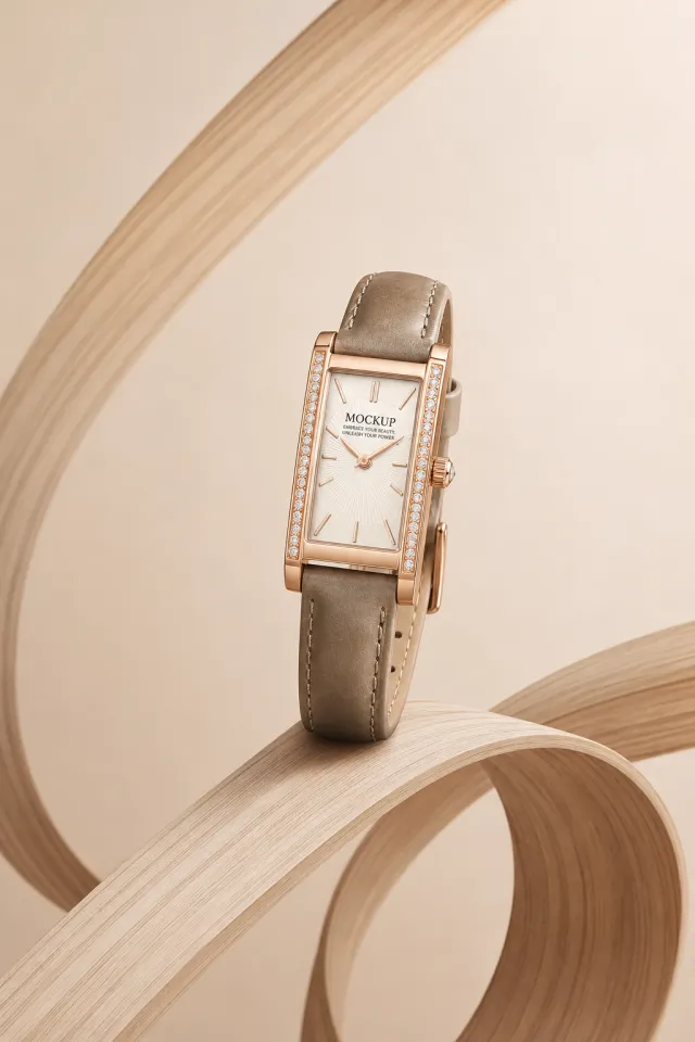
Use the supplied reference image as the sole locked product input. Preserve the product's exact appearance, structure, materials, colors, proportions, logo, label, accessories, and product-set relationship. Create a 2:3 photorealistic commercial product poster. Place the single rectangular taupe leather watch upright on looping pale wood ribbons. Use a warm cream background, sculptural curves, soft shadows, and understated jewelry light. Use a polished premium advertising finish with crisp product focus, coherent perspective, realistic materials, controlled depth of field, and physically plausible lighting. Keep all decorative elements physically plausible and subordinate to the product. Keep existing product text legible when present. No poster text, watermark, extra product, unrelated logo, distorted object, changed product appearance, or unnecessary person.

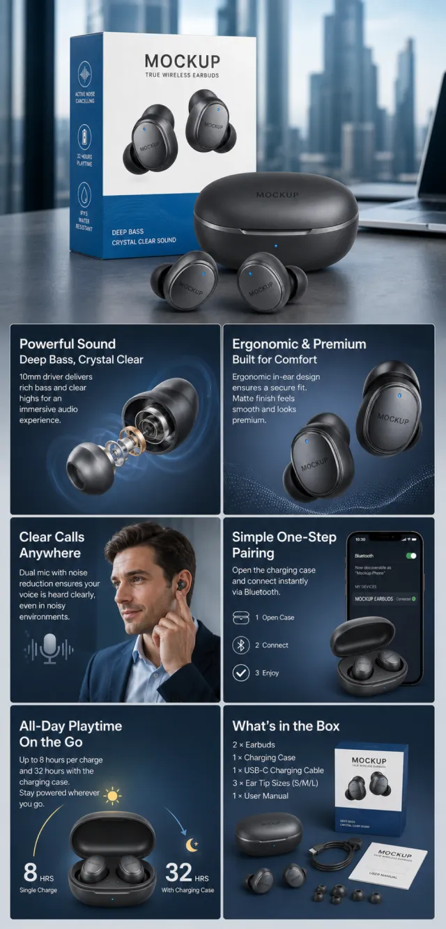
【Execution Route | Must Not Appear on Screen】 If the image-generation tool can be invoked multiple times: concatenate the sharing rules with A–F separately, and execute six times; each time, generate only one independent 1000×1000 square image, resulting in six sub-images. If single‑shot generation is permitted: use a 2:3 vertical canvas measuring 1200×2500, with the top approximately 30% reserved for the product’s main visual integrated into the background, and arrange A/B, C/D, and E/F in two columns by three rows to form a six‑grid layout; all six cards should be equal in size and maintain an aspect ratio close to 1:1. Do not use a 1:1 outer canvas, nor full‑width cards, cross‑column cards, merged cards, borders, frames, or white margins. 【Sharing Rules】 The provided product reference image serves as the sole basis for the product’s appearance, structure, color, quantity, accessories, and relative proportions. Product orientation: gray‑blue true wireless earbuds, charging case, and packaging box; focusing on wearing, connectivity, calls, battery life, and portability. The product itself, along with any newly generated characters, animals, props, or text, must maintain natural proportions—stretching, flattening, or non‑uniform scaling is prohibited—and the background must extend fully across all four edges. Branding must uniformly follow the MOCKUP style; remove original branding, logos, watermarks, contact information, social media accounts, platform details, gibberish, and irrelevant content. Copywriting should be concise, clear, and credible, retaining the language of the reference image, without adding unverified absolute claims or medical promises. A–F are merely control markers and must not appear on screen. 【A | Core Selling Point】 Highlight the product’s most important value and its complete main subject; keep the title short and clear. 【B | Structure and Materials】 Showcase the product’s key structures, materials, or components using close‑up shots or simple annotations, adhering to the product’s intended direction. 【C | Real‑World Use】 Generate natural human/animal figures or everyday scenes to demonstrate realistic usage, ensuring proportions and actions appear believable. 【D | Details and Steps】 Use close‑ups, step‑by‑step instructions, or flowcharts to explain operations, textures, interfaces, storage, or maintenance details. 【E | Lifestyle】 Illustrate how the product naturally integrates into family life, commuting, outdoor activities, travel, or work settings. 【F | Sets and Portability】 Accurately depict the product, its accessories, quantities, and storage relationships; do not add any components absent from the reference image.
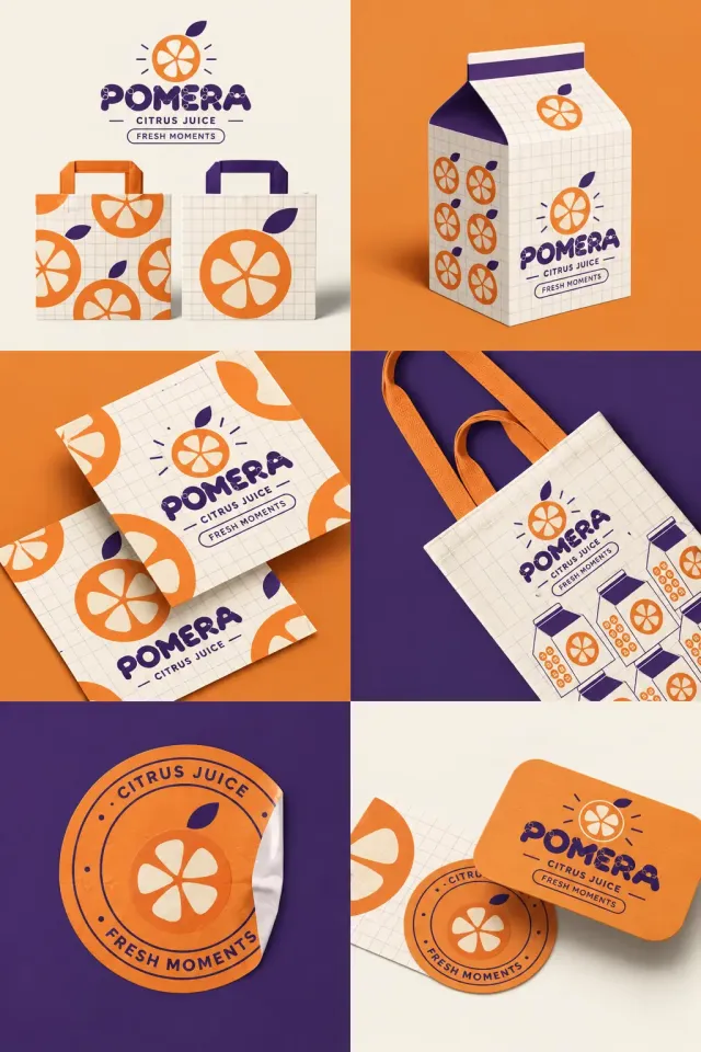
设计 2:3 纵向果汁品牌六宫格展示图,严格两列三行。品牌 POMERA,深紫色圆润分段大写字母带小圆关节,辅助字 CITRUS JUICE 和 FRESH MOMENTS。图标是橙色柑橘圆切片,内部五个奶白果瓣,顶端一片紫叶,周围少量短射线。所有浅色包装铺细淡紫方格。左上奶油底组合标志,下方两只橙和紫提手纸袋,分别印重复及放大果片;右上橙底真实屋顶饮料纸盒,紫色封顶,侧面六个果片。左中橙底两张重叠方卡,果片被边缘裁切,中央品牌文字;右中紫底奶油帆布袋,橙色织带提手,印品牌及多只迷你饮料盒。左下紫底大圆形橙色贴纸,边沿翘起露出白底,环形文字 CITRUS JUICE · FRESH MOMENTS;右下奶油底,橙色圆角名片、圆贴与方格卡叠放。真实厚纸、布料和黏贴纸材质,鲜亮橙紫对比、清楚网格和统一果片标识。

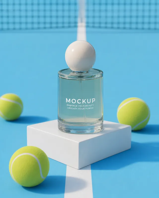
Use the supplied reference image as the sole locked product input. Preserve the product's exact appearance, structure, materials, colors, proportions, logo, label, accessories, and product-set relationship. Create a 561:701 photorealistic commercial product poster. Place the single aqua perfume bottle upright on a white cube at the center of a bright blue tennis court. Add yellow tennis balls, a net, hard sunlight, and clean long shadows. Use a polished premium advertising finish with crisp product focus, coherent perspective, realistic materials, controlled depth of field, and physically plausible lighting. Keep all decorative elements physically plausible and subordinate to the product. Keep existing product text legible when present. No poster text, watermark, extra product, unrelated logo, distorted object, changed product appearance, or unnecessary person.
【Execution Route | Must Not Appear on Screen】 If the image-generation tool can be invoked multiple times: concatenate the sharing rules with A–F separately and execute six times; each time, generate only one independent 1000×1000 square image, resulting in six sub‑images. If only single‑shot generation is allowed: use a 2:3 vertical canvas measuring 1200×2500, with approximately 30% at the top reserved for the product’s main visual integrated into the background, and arrange the remaining area into a 2‑column × 3‑row grid labeled A/B, C/D, and E/F. All six cards should be equal in size, with an aspect ratio close to 1:1. Do not use a 1:1 outer canvas, nor full‑width cards, cross‑column cards, merged cards, borders, frames, or white margins. 【Sharing Rules】 The provided product reference image serves as the sole basis for the product’s appearance, structure, color, quantity, accessories, and relative proportions. Product orientation: coral‑colored guava‑aloe body lotion pump bottle; tropical fruit, refreshing lotion, and bathroom care. The product itself, along with any newly generated characters, animals, props, or text, must maintain natural proportions—stretching, flattening, or non‑uniform scaling is prohibited—and the background must extend fully across all four edges. Branding must uniformly follow MOCKUP; remove original branding, logos, watermarks, contact information, social media accounts, platform details, gibberish, and irrelevant content. Copywriting should be concise, clear, and credible, retaining the language of the reference image, without adding unsubstantiated absolute claims or medical promises. A–F are merely control markers and must not appear on screen. 【A | Core Selling Point】 Highlight the product’s most important value and its complete main subject; keep the title short and clear. 【B | Structure and Materials】 Showcase key structural elements, materials, or components using close‑up shots or simple annotations, adhering to the product’s intended direction. 【C | Real‑World Use】 Generate natural human/animal figures or everyday scenes to demonstrate realistic usage, ensuring proportions and actions appear believable. 【D | Details and Steps】 Use close‑ups, step‑by‑step instructions, or flowcharts to explain operations, textures, interfaces, storage solutions, or care details. 【E | Lifestyle】 Illustrate how the product seamlessly integrates into daily life scenarios such as home, commuting, outdoor activities, travel, or work. 【F | Sets and Portability】 Accurately depict the product, its accessories, quantities, and storage relationships; do not add any components absent from the reference image.

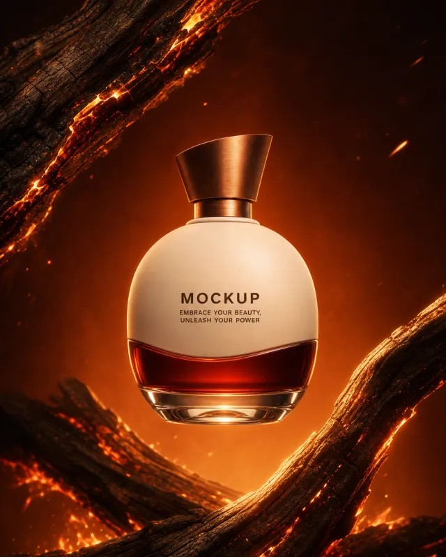
Use case: ads-marketing / product-mockup Asset type: vertical warm-ember fragrance poster, 4:5 Input images: Image 1 is the authoritative product identity reference. Use exactly this bottle without redesigning it. Float the exact bottle from Image 1 at the center of a deep burnt-orange scene. Frame it with two sweeping charred branches from opposite corners, glowing ember cracks, sparse sparks, and subtle heat haze. Do not include people or hands. Preserve the bottle exactly: wide matte-ivory oval body, transparent ember-red glass band wrapping the lower third with curved upper edge, beveled clear base, short brushed-copper neck, asymmetrical copper wedge cap, front view, proportions, colors, and label placement. Preserve the text verbatim: "MOCKUP" and "EMBRACE YOUR BEAUTY, UNLEASH YOUR POWER". No other text. Style: high-end photorealistic fragrance advertising with realistic ceramic, glass, copper, charred wood, sparks, and heat haze. Composition: vertical 4:5, centered floating product, strong opposing branch diagonals. Lighting: intense amber rim light with deep warm shadows. Palette: burnt orange, ember red, matte ivory, copper, black-brown. Constraints: exactly one bottle; no human limbs; no poster copy; no extra logo; no watermark; keep the product identical to Image 1.

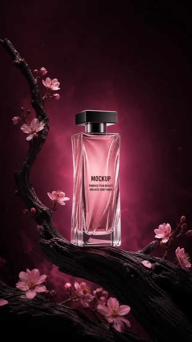
Use case: ads-marketing / product-mockup Asset type: very tall romantic fragrance poster, approximately 9:16 Input images: Image 1 is the authoritative product identity reference. Use exactly this bottle without redesigning it. Place the exact bottle from Image 1 upright on a newly curved blackened branch against a deep burgundy-to-black background. Add pale-pink blossoms and buds, faint rose haze, tiny dust motes, magenta backlight, and generous dark negative space. Preserve the bottle exactly: tall rose-pink prism, softly twisted vertical clear-glass planes, rounded corners, heavy asymmetric clear base, short gunmetal cylindrical neck, flat wide square black cap, proportions, front view, color, and label placement. Preserve the text verbatim: "MOCKUP" and "EMBRACE YOUR BEAUTY, UNLEASH YOUR POWER". No other text. Style: high-end photorealistic fragrance advertising with realistic glass, wood grain, blossoms, haze, and reflections. Composition: very tall vertical frame, centered product in lower-middle, diagonal branch, blossoms framing but not covering label. Lighting: luminous magenta backlight and narrow soft spotlight. Palette: burgundy, black, rose quartz, blush pink, gunmetal. Constraints: exactly one bottle; no floating poster copy; no extra logo; no watermark; keep the product identical to Image 1.

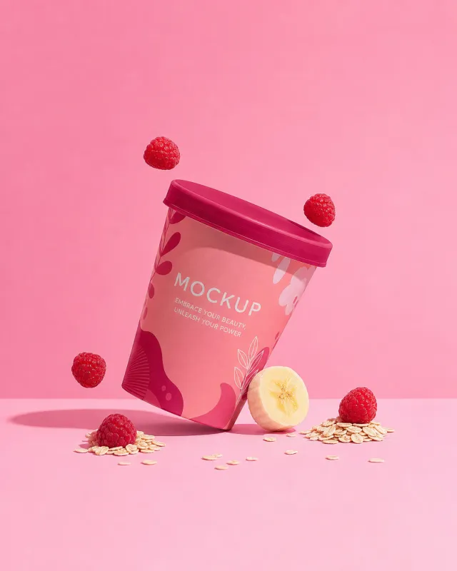
Use the supplied reference image as the sole locked product input. Preserve the product's exact appearance, structure, materials, colors, proportions, logo, label, accessories, and product-set relationship. Create a 561:701 photorealistic commercial product poster. Tilt the single pink cup above a seamless pink surface. Scatter raspberries, a banana slice, oat flakes, and a few floating fruit pieces around it with clean graphic shadows. Use a polished premium advertising finish with crisp product focus, coherent perspective, realistic materials, controlled depth of field, and physically plausible lighting. Keep all decorative elements physically plausible and subordinate to the product. Keep existing product text legible when present. No poster text, watermark, extra product, unrelated logo, distorted object, changed product appearance, or unnecessary person.

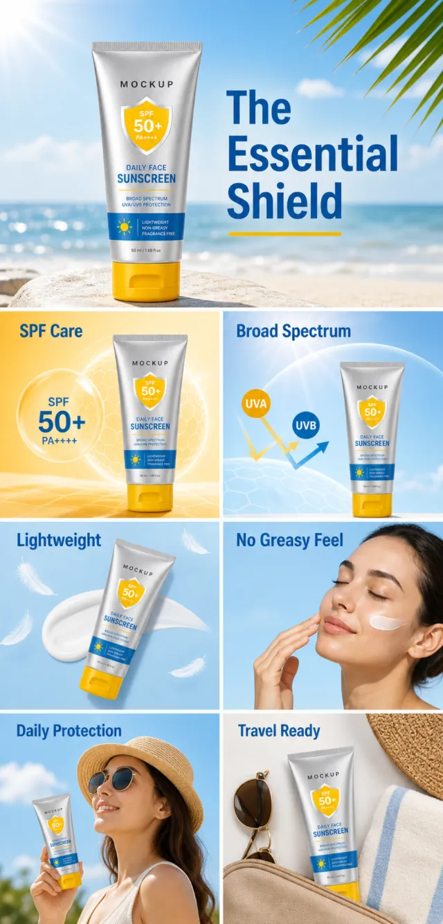
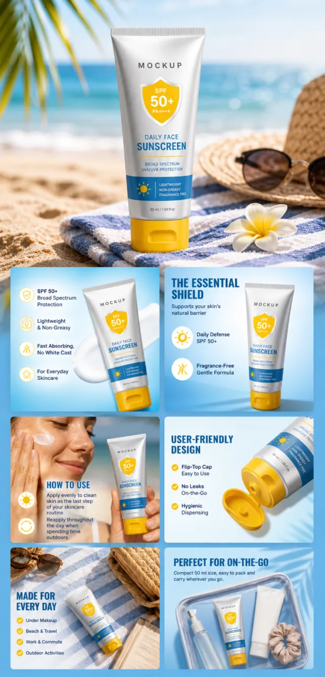
【Execution Routing | Do Not Display】 If the image-generation tool can be invoked multiple times: concatenate the sharing rules with A–F separately, execute six times, generating one 1000×1000 square image each time; do not submit all modules at once. If only one image can be generated per run: set the interface or API to a 2:3 portrait orientation and disable Auto mode; a recommended size is 1200×1800. Arrange A/B, C/D, and E/F into a 2-column × 3-row grid of six modules, ensuring equal module sizes and maintaining a 1:1 aspect ratio. If the platform enforces a 1:1 ratio, switch to using an Agent or generate each module individually. 【Sharing Rules】 The provided product reference image serves as the sole basis for the product. Product: daily face sunscreen. Copywriting must be in English, with brand placeholders limited to MOCKUP. Visuals should incorporate silver, bright yellow, sky blue, and white. The product’s appearance, structure, colors, quantity, accessories, and relative proportions must match the reference image; product, figures, icons, and props should maintain natural proportions. All essential information must remain within the safe zone, with the background extending fully across all four edges. External white borders, vertical borders on left and right, transparent padding, watermarks, contact details, social media accounts, platform information, original branding, garbled text, irrelevant information, or unverified claims regarding efficacy or specifications are prohibited. Headlines must not be displayed. A–F must not appear. 【A | Theme】Copy: “The Essential Shield”; focus on conveying the core value through the complete primary visual of the product. 【B | Theme】Copy: “SPF Care”; design an independent square image around this theme, avoiding overlapping selling points, compositions, and product angles with other modules. 【C | Theme】Copy: “Broad Spectrum”; design an independent square image around this theme, avoiding overlapping selling points, compositions, and product angles with other modules. 【D | Theme】Copy: “Lightweight”; design an independent square image around this theme, avoiding overlapping selling points, compositions, and product angles with other modules. 【E | Theme】Copy: “No Greasy Feel”; design an independent square image around this theme, avoiding overlapping selling points, compositions, and product angles with other modules. 【F | Theme】Copy: “Daily Protection”; “Travel Ready”; design independent square images around these themes, avoiding overlapping selling points, compositions, and product angles with other modules.

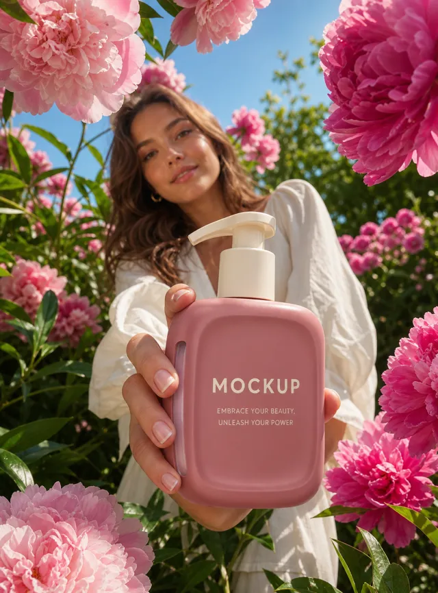
Use case: ads-marketing / product-mockup Asset type: vertical floral body-lotion campaign Input images: Image 1 is the authoritative product identity reference. Place exactly this bottle in the model's hand without redesigning it. Create a photorealistic low-angle garden campaign with one adult model in the middle distance extending the exact bottle from Image 1 toward the camera. Frame the scene with large blush and magenta peonies, glossy green leaves, bright blue sky, and clear sunlight. Keep the hand and product sharp and the face secondary. Preserve the bottle exactly: rounded-square dusty-rose body, softly concave inset center, translucent pale-pink left-side window, matte-ivory short neck and wide pump, front view, proportions, colors, finish, and label placement. Preserve the text verbatim: "MOCKUP" and "EMBRACE YOUR BEAUTY, UNLEASH YOUR POWER". No other text. Style: photorealistic premium beauty lifestyle advertising with realistic skin, fingers, flowers, leaves, plastic, and daylight depth. Composition: vertical, bottle fills lower-center foreground, model behind, flowers frame without covering label. Lighting: clear sunny garden daylight, joyful and fresh. Palette: dusty rose, blush, magenta, cream, leaf green, sky blue. Constraints: exactly one bottle; natural fingers; no poster copy; no extra logo; no watermark; keep the product identical to Image 1.

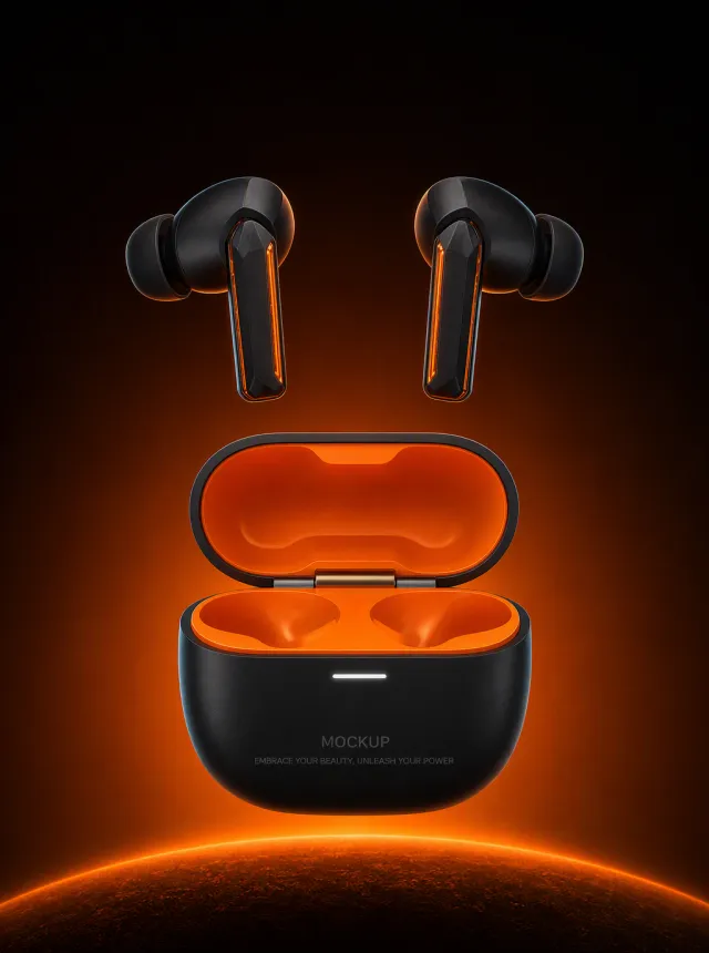
以参考图为唯一且权威的产品参考,生成一张黑橙高对比的游戏耳机新品海报。 - 商品套装必须完全一致:两只哑光黑入耳式耳机,均含多面切割声学腔体、烟黑硅胶耳塞、细长刀锋形耳柄和贯穿外侧的半透明焦橙色嵌条;配套卵石形哑光黑充电盒,亮焦橙内腔、深钛色铰链、开盖状态和一条白色状态灯。 - 充电盒正面的 `MOCKUP` 与 `EMBRACE YOUR BEAUTY, UNLEASH YOUR POWER` 内容、层级和位置必须保持一致。 - 商品悬浮于黑色至深琥珀色渐变棚拍空间中,下方为柔和弧形焦橙“星球”台座和细橙色轮廓光,两只耳机对称悬浮在开盖充电盒上方。 - 使用强橙色底光与受控冷色边缘光,准确表现哑光黑、半透明橙色嵌条、硅胶、铰链和状态灯。 - 去除水印、原图品牌、中英文标题、参数、日期和脚注;只保留两只耳机和一个充电盒,不添加其他配件或文字。

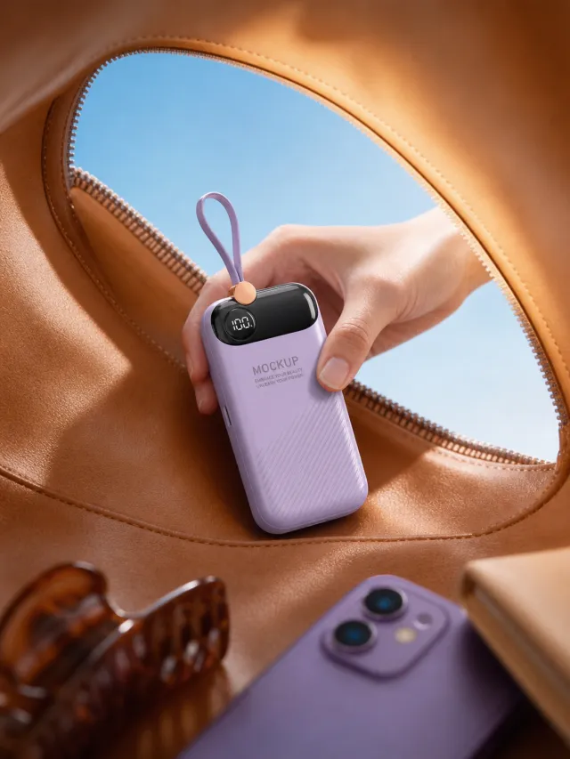
Use the supplied reference image as the sole locked product input. Preserve the product's exact appearance, structure, materials, colors, proportions, logo, label, accessories, and product-set relationship. Create a 3:4 photorealistic commercial product poster. Show one hand lifting the single lavender power bank from the open zipper of a tan leather bag. Include a purple phone and tortoiseshell hair clip in the lower foreground, a blue sky opening, and warm travel-editorial light. Use a polished premium advertising finish with crisp product focus, coherent perspective, realistic materials, controlled depth of field, and physically plausible lighting. Keep all decorative elements physically plausible and subordinate to the product. Keep existing product text legible when present. No poster text, watermark, extra product, unrelated logo, distorted object, changed product appearance, or unnecessary person.

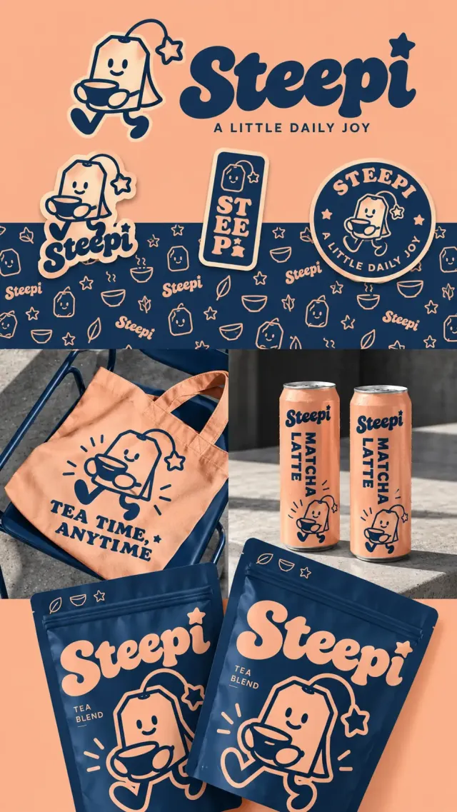
创作纵向茶饮品牌视觉与包装展示长图,桃杏色与深墨蓝双色主导。品牌 Steepi 使用厚实复古圆润字形,i 的点是星星,标语 A LITTLE DAILY JOY。吉祥物为切角长方茶包,头顶弯绳连星形吊签,笑脸、戴手套般的小手捧茶杯、弯腿迈步。顶部大字标及角色,下方三种贴纸:人物异形贴、竖向 ST EE Pi 字样长方贴、圆形 STEEPI 与标语徽章。横向墨蓝纹样带密布桃色线描茶包、叶片、星星、碗和品牌。中部左侧墨蓝金属椅上的桃色帆布袋,人物与 TEA TIME, ANYTIME 字样;右侧灰混凝土台上两只桃色细长铝罐,深蓝 Steepi 和竖排 MATCHA LATTE,水珠与金属反光清楚。底部两只大号深蓝自封袋倾斜重叠,印桃色大字标、TEA BLEND 和放大迈步茶包角色。纸袋薄膜、棉布、金属均为真实摄影质感,活泼又整齐。

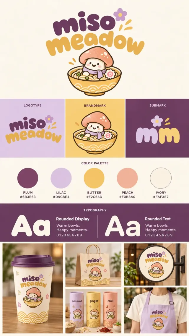
生成 9:16 竖版面食餐厅品牌规范展板,品牌 miso meadow,两行柔软泡泡小写字,miso 为梅紫,meadow 为奶油金,旁有丁香紫五瓣花与三道金色短线。吉祥物是微笑蘑菇,桃色圆菌盖带白色斑点、奶油白菌柄、紫色围巾,坐在装有面条、葱圈和鱼板花片的金色拉面碗里,碗外壁有半圆波纹。 上部米白底大字标与蘑菇碗组合。下一排三等分小板,标题 LOGOTYPE、BRANDMARK、SUBMARK,对应完整字标、蘑菇碗、带花的小写 mm。随后五个圆形色板准确写 PLUM #6B3E63、LILAC #D9C8E4、BUTTER #F2C66D、PEACH #F0B8A0、IVORY #FAF3E7。梅紫字体区分两栏,标题 Rounded Display 与 Rounded Text,展示大 Aa、Warm bowls. Happy moments.、0123456789。 底部五张应用照片:左侧长图是木桌上的紫盖奶油纸杯,印字标、蘑菇与花纹;中上牛皮提袋,中下三只丁香紫、金黄、桃色调味圆筒,分别写 sesame、ginger、chili;右上圆形外挑门头招牌;右下成年模特穿米白T恤与丁香紫围裙的局部。所有应用使用相同蘑菇角色、花朵与半圆波纹。自然暖光、温柔纸张质感,干净清晰。

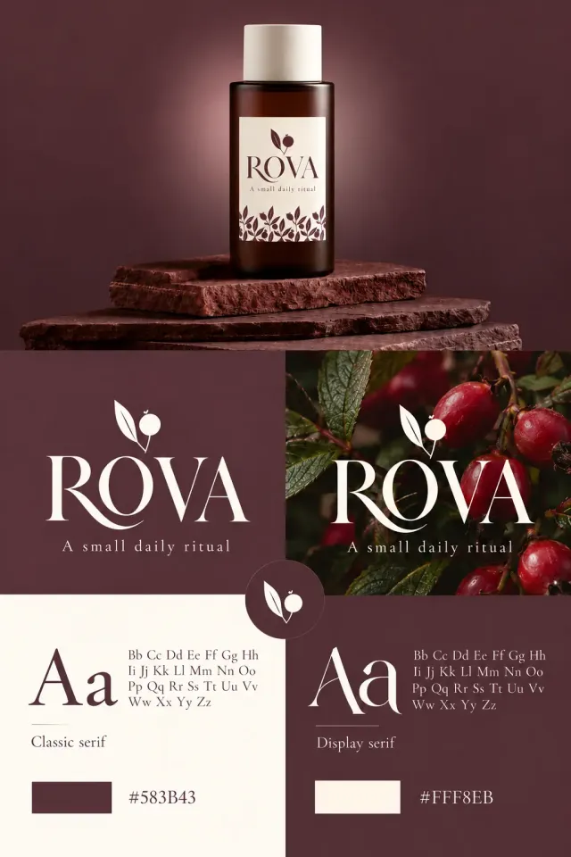
2:3竖幅植物护肤品牌规范图,深勃艮第红和暖象牙白配色。顶部一只深琥珀色圆柱瓶,象牙白圆盖,奶白标签写优雅细衬线ROVA、A small daily ritual,字标上方单片细长左倾叶子与一颗带小萼的圆果相连,标签底部密排叶果枝纹。瓶立于三块粗糙红棕石板上,背后柔光晕。中部左右双栏,左边红底白色ROVA、同一单叶果实标志和标语,右边深色玫瑰果及绿叶照片上同样排版。中下交界圆形徽章中再次呈现单叶圆果。底部左奶白右红,分别展示Aa与小写大写字母样本,标Classic serif和Display serif;最下色块及#583B43、#FFF8EB。细纸纹、柔和自然光和精致衬线排版。

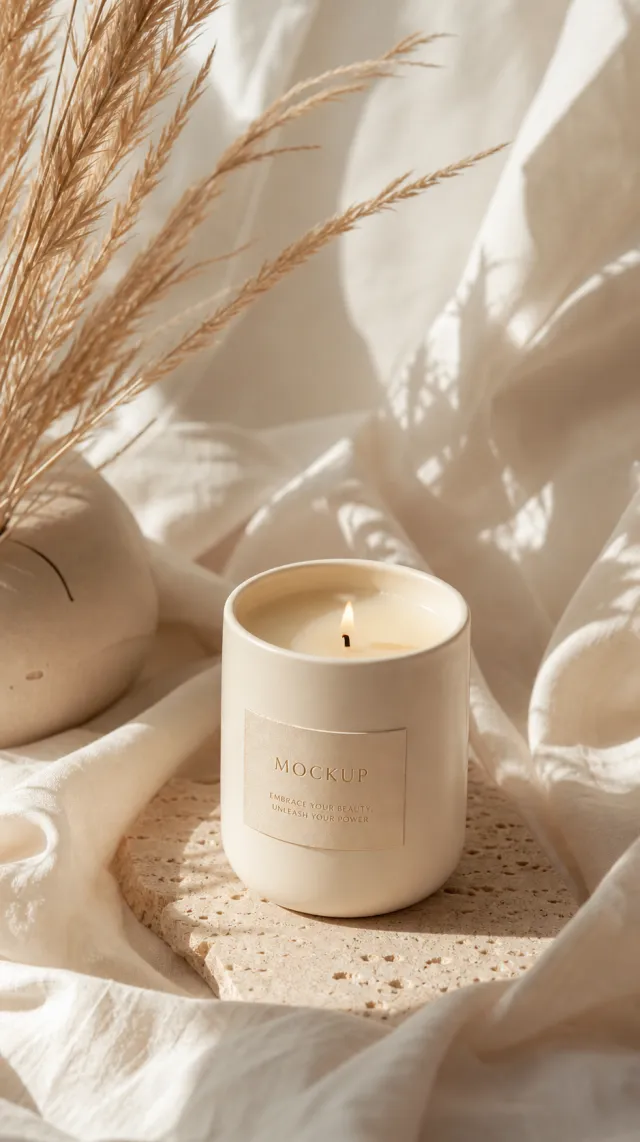
Use the supplied reference image as the sole locked product input. Preserve the product's exact appearance, structure, materials, colors, proportions, logo, label, accessories, and product-set relationship. Create a 939:1676 photorealistic commercial product poster. Place the single cream candle upright on a porous stone coaster amid softly rumpled white linen. Add pampas grass, a cream ceramic vase, warm sunbeams, and gentle neutral shadows. Use a polished premium advertising finish with crisp product focus, coherent perspective, realistic materials, controlled depth of field, and physically plausible lighting. Keep all decorative elements physically plausible and subordinate to the product. Keep existing product text legible when present. No poster text, watermark, extra product, unrelated logo, distorted object, changed product appearance, or unnecessary person.

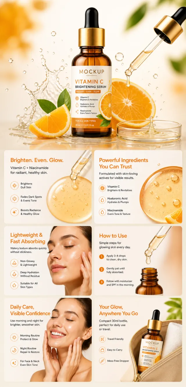
【Execution Route | Must Not Appear on Screen】 If the image-generation tool can be invoked multiple times: concatenate the sharing rules with A–F separately, and execute six times; each time, generate only one independent 1000×1000 square image, resulting in six sub-images. If single‑shot generation is permitted: use a 2:3 vertical canvas measuring 1200×2500, with the top approximately 30% reserved for the product’s main visual integrated into the background, and arrange A/B, C/D, and E/F in two columns by three rows to form a six‑grid layout. All six cards should be equal in size, with visual proportions close to 1:1. Do not use a 1:1 outer canvas, nor full‑width cards, cross‑column cards, merged cards, borders, frames, or white margins. 【Sharing Rules】 The provided product reference image serves as the sole basis for the product’s appearance, structure, color, quantity, accessories, and relative proportions. Product orientation: Vitamin C facial serum bottle; orange‑colored skincare, essence‑textured, dropper‑dispensed, applied via smearing, intended for daily care and portability. The product itself, along with any newly generated characters, animals, props, or text, must maintain natural proportions—stretching, flattening, or non‑uniform scaling is prohibited—and the background must extend fully across all four edges. Branding must uniformly follow the MOCKUP style; remove original branding, logos, watermarks, contact information, social media accounts, platform details, gibberish, and irrelevant content. Copywriting should be concise, clear, and credible, retaining the language of the reference image, without adding unverified absolute claims or medical promises. A–F are merely control markers and must not appear on screen. 【A | Core Selling Point】 Highlight the product’s most important value and its complete subject matter, with a short, clear title. 【B | Structure & Materials】 Showcase the product’s key structural elements, materials, or components using close‑up shots or simple annotations, adhering to the product’s designated orientation. 【C | Real‑World Use】 Generate natural human/animal figures or everyday scenes to demonstrate realistic usage, ensuring proportions and actions are believable. 【D | Details & Steps】 Use close‑ups, step‑by‑step instructions, or flowcharts to explain operations, textures, interfaces, storage solutions, or care‑related details. 【E | Lifestyle】 Depict how the product naturally integrates into family life, commuting, outdoor activities, travel, or work settings. 【F | Sets & Carrying】 Accurately present the product, its accessories, quantities, and storage relationships; do not add any components absent from the reference image.

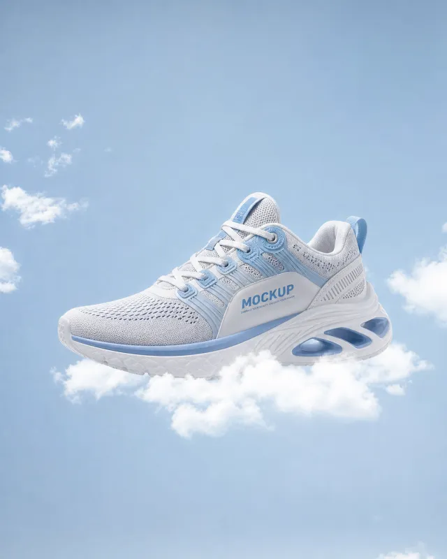
Use the supplied reference image as the sole locked product input. Preserve the product's exact appearance, structure, materials, colors, proportions, logo, label, accessories, and product-set relationship. Create a 561:701 photorealistic commercial product poster. Float the single white-and-light-blue running shoe above a soft white cloud against a clear blue sky. Use side-profile framing, airy daylight, and a clean weightless sports-advertising look. Use a polished premium advertising finish with crisp product focus, coherent perspective, realistic materials, controlled depth of field, and physically plausible lighting. Keep all decorative elements physically plausible and subordinate to the product. Keep existing product text legible when present. No poster text, watermark, extra product, unrelated logo, distorted object, changed product appearance, or unnecessary person.

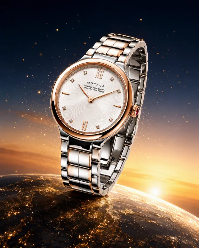
Use the supplied reference image as the sole locked product input. Preserve the product's exact appearance, structure, materials, colors, proportions, logo, label, accessories, and product-set relationship. Create a 561:701 photorealistic commercial product poster. Float the single two-tone watch above a curved golden planetary horizon scattered with tiny metallic grains. Use a deep navy-to-amber sunset sky, cinematic rim light, and weightless luxury styling. Use a polished premium advertising finish with crisp product focus, coherent perspective, realistic materials, controlled depth of field, and physically plausible lighting. Keep all decorative elements physically plausible and subordinate to the product. Keep existing product text legible when present. No poster text, watermark, extra product, unrelated logo, distorted object, changed product appearance, or unnecessary person.

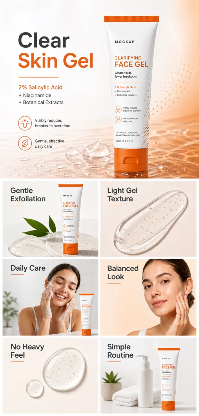
【Execution Routing | Do Not Display】 If the image-generation tool can be invoked multiple times: concatenate the sharing rules with A–F separately, execute six times, generating one 1000×1000 square image each time; do not submit all modules at once. If only one image can be generated per run: set the interface or API to a 2:3 portrait orientation and disable Auto mode; a recommended size is 1200×1800. Arrange A/B, C/D, and E/F into a 2-column × 3-row grid of six modules, ensuring equal module sizes and maintaining a 1:1 aspect ratio. If the platform enforces a 1:1 ratio, switch to using an Agent or generate each module individually. 【Sharing Rules】 The provided product reference image serves as the sole basis for the product. Product: clarifying face gel. Copywriting must be in English, with brand placeholders replaced by MOCKUP only. Visuals should incorporate white, burnt orange, peach, and charcoal. The product’s appearance, structure, color, quantity, accessories, and relative proportions must match the reference image; products, figures, icons, and props must maintain natural proportions. All essential information must remain within the safe zone, with the background extending fully to all four edges. External white borders, vertical borders on left and right, transparent fill-in borders, watermarks, contact details, social media accounts, platform information, original branding, gibberish, irrelevant content, or unverified claims regarding efficacy or specifications are prohibited. Headlines must not be displayed. A–F must not appear. 【A | Theme】Copy: “Clear Skin Gel”; use the full product main visual to prominently convey its core value. 【B | Theme】Copy: “Gentle Exfoliation”; design an independent square image around this theme, ensuring it avoids duplicating selling points, compositions, or product angles with other modules. 【C | Theme】Copy: “Light Gel Texture”; design an independent square image centered on this theme, avoiding overlap in selling points, composition, and product perspective with other modules. 【D | Theme】Copy: “Daily Care”; create an independent square image based on this theme, while preventing repetition of selling points, composition, and product angles compared to other modules. 【E | Theme】Copy: “Balanced Look”; develop an independent square image revolving around this theme, ensuring no duplication of selling points, composition, or product angles with other modules. 【F | Theme】Copy: “No Heavy Feel” and “Simple Routine”; design separate square images for these themes, avoiding overlap in selling points, composition, and product angles with other modules.

【Execution Route | Must Not Appear on Screen】 If the image-generation tool can be invoked multiple times: concatenate the sharing rules with A–F separately and execute six times; each time, generate only one independent 1000×1000 square image, resulting in six sub-images. If only single‑shot generation is allowed: use a 2:3 vertical canvas measuring 1200×2500, with the top approximately 30% reserved for the product’s main visual integrated into the background, and arrange the remaining area into a 2‑column × 3‑row grid labeled A/B, C/D, and E/F. All six cards should be equal in size, with an aspect ratio close to 1:1. Do not use a 1:1 outer canvas, nor full‑width cards, cross‑column cards, merged cards, borders, frames, or white margins. 【Sharing Rules】 The provided product reference image serves as the sole basis for the product’s appearance, structure, color, quantity, accessories, and relative proportions. Product orientation: sunscreen lotion tube; themes include sunny beaches, application, even coverage, and portability—avoid making absolute sun-protection claims. The product itself, along with any newly generated characters, animals, props, or text, must maintain natural proportions; stretching, flattening, or non‑uniform scaling is prohibited. The background should extend fully across all four edges. Branding must uniformly use MOCKUP; remove original branding, logos, watermarks, contact information, social media accounts, platform details, gibberish, and irrelevant content. Copywriting should be concise, clear, and credible, maintaining the language of the reference image, and refraining from adding unsupported absolute or medical claims. A–F are merely control markers and must not appear on screen. 【A | Core Selling Point】 Highlight the product’s most important value and its complete subject matter; keep the headline short and clear. 【B | Structure and Materials】 Showcase the product’s key structural elements, materials, or components using close-up shots or simple annotations, adhering to the product’s intended orientation. 【C | Real‑World Use】 Generate natural scenes featuring people, animals, or everyday life to demonstrate realistic usage, ensuring proportions and actions appear believable. 【D | Details and Steps】 Use close-ups, step-by-step illustrations, or flowcharts to explain operations, textures, interfaces, storage solutions, or care instructions. 【E | Lifestyle】 Depict how the product naturally integrates into family life, commuting, outdoor activities, travel, or work settings. 【F | Sets and Portability】 Accurately present the product, its accessories, quantities, and storage relationships; do not add any components absent from the reference image.