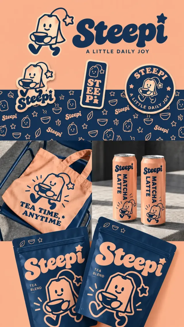
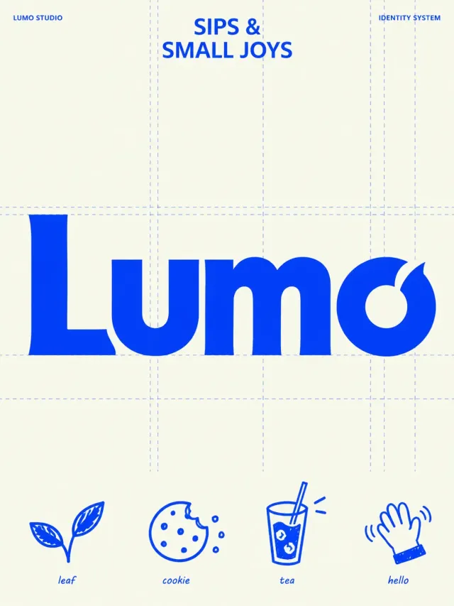
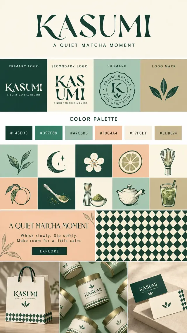
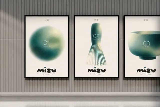
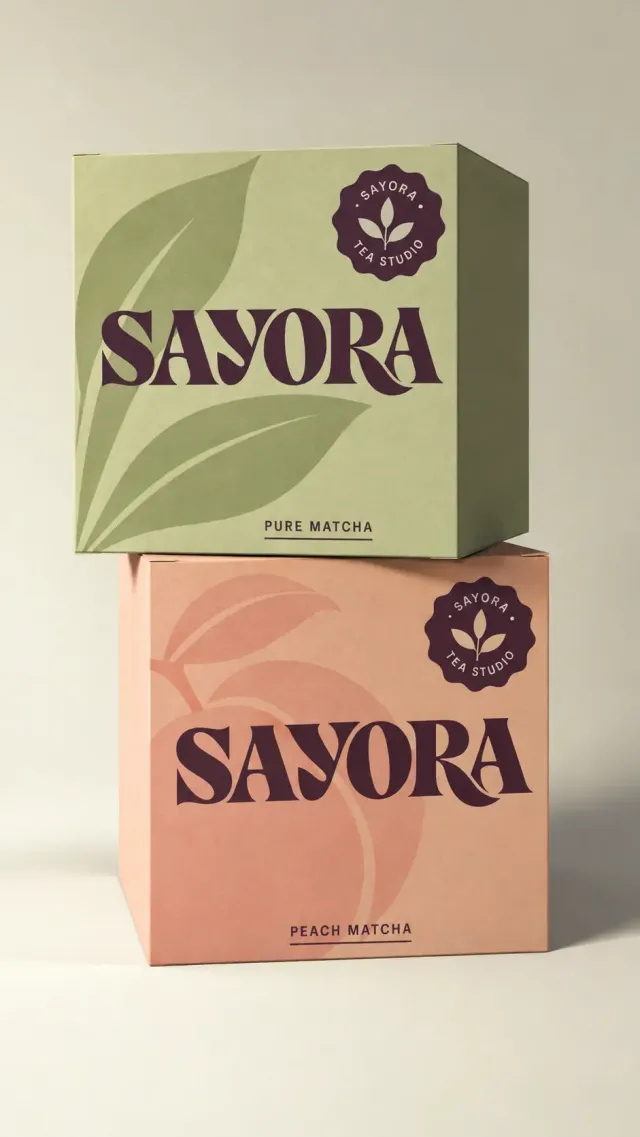
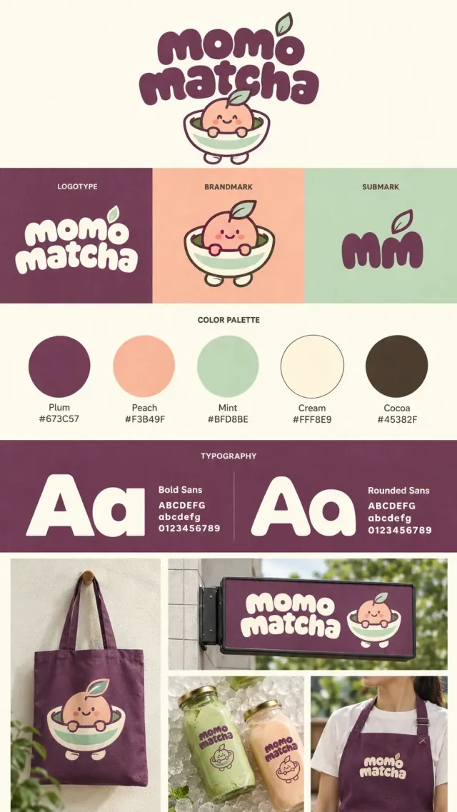
创作纵向茶饮品牌视觉与包装展示长图,桃杏色与深墨蓝双色主导。品牌 Steepi 使用厚实复古圆润字形,i 的点是星星,标语 A LITTLE DAILY JOY。吉祥物为切角长方茶包,头顶弯绳连星形吊签,笑脸、戴手套般的小手捧茶杯、弯腿迈步。顶部大字标及角色,下方三种贴纸:人物异形贴、竖向 ST EE Pi 字样长方贴、圆形 STEEPI 与标语徽章。横向墨蓝纹样带密布桃色线描茶包、叶片、星星、碗和品牌。中部左侧墨蓝金属椅上的桃色帆布袋,人物与 TEA TIME, ANYTIME 字样;右侧灰混凝土台上两只桃色细长铝罐,深蓝 Steepi 和竖排 MATCHA LATTE,水珠与金属反光清楚。底部两只大号深蓝自封袋倾斜重叠,印桃色大字标、TEA BLEND 和放大迈步茶包角色。纸袋薄膜、棉布、金属均为真实摄影质感,活泼又整齐。
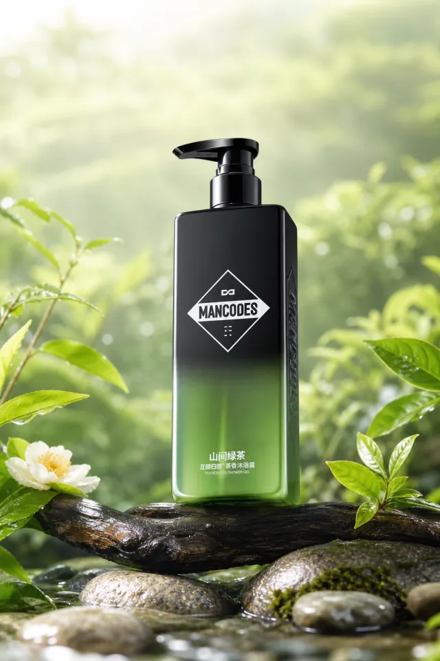
Use the provided white-background product image as the locked reference. Preserve the tall rectangular black shower-gel bottle exactly: translucent forest-green lower section, black pump, white diamond MANCODES logo, side branding, printed product information, bottle proportions, glossy material, and front three-quarter view.
Create a premium vertical body-care poster in a bright spring tea-garden setting. Place the bottle on a wet dark wood branch, with soft green tea-garden bokeh behind it. Arrange a small number of dewy young tea leaves, white camellia blossoms, smooth river stones, and low moss around the product. Use clearly different flower varieties, prop placement, branch shape, lighting direction, and foreground composition from the source while keeping the same fresh, natural tea-inspired mood.
Constraints: the bottle is the only hero product; no added poster text, price, watermark, border, people, hands, duplicate bottles, altered pump, altered logo, or altered bottle information.
【Output Rules | Do Not Display】
Generate only one 1000×1000, 1:1 Amazon Listing secondary image. No collage images, six-grid layouts, multi-card grids, or multiple scenes are allowed.
【Sharing Rules】
Use the provided product reference image as the sole basis for the product. Product: Dewy Jelly Face Cream. Copywriting must be in English, and brand placeholders should use MOCKUP only. Visuals should follow high-end commercial e-commerce photography standards—clear imagery, distinct layering, and concise, easy-to-read copy. The product’s appearance, structure, color, quantity, accessories, and relative proportions must match the reference image; products, people, icons, and props must maintain natural proportions. All essential information must remain within the safe area, with the background extending fully to all four edges. External white borders, vertical borders on left and right, transparent edge fillers, watermarks, contact information, social media accounts, platform details, original branding, gibberish, irrelevant information, or unverified claims regarding efficacy or specifications are prohibited. Headlines must not appear.
【Image Composition】
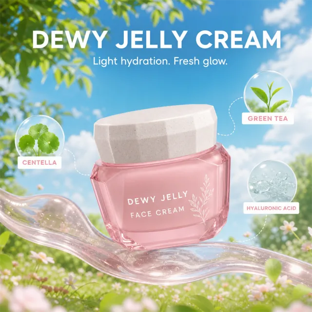
Create a dreamy hero featuring a pink jar floating above a translucent gel ribbon in a bright blue-sky meadow dotted with leafy trees and tiny pale blossoms. Exact copy: "DEWY JELLY CREAM", "Light hydration. Fresh glow.", "CENTELLA", "GREEN TEA", "HYALURONIC ACID".
Ensure that every product, person, animal, icon, and graphic maintains natural proportions. Keep all headings, labels, numbers, and icons fully visible within the safe areas. Extend the artwork continuously to all four edges.
People and animals: if included, generate new, non-identifiable subjects appropriate to the usage scenario.
Use the supplied reference image as the sole locked product input. Preserve the product's exact appearance, structure, materials, colors, proportions, logo, label, accessories, and product-set relationship.
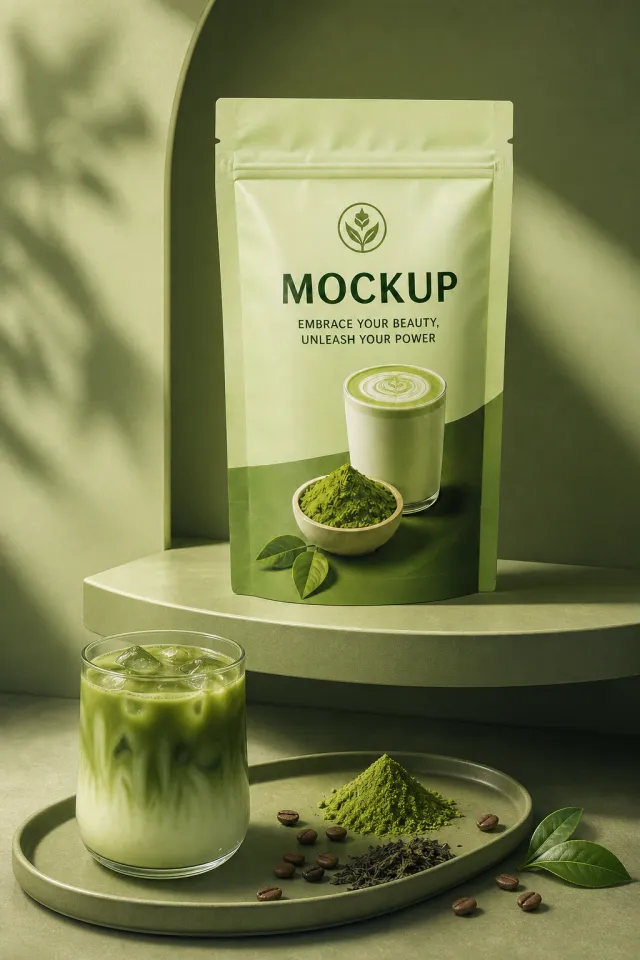
Create a 2:3 photorealistic commercial product poster. Place the single green matcha pouch upright on a curved green shelf. Add a glass of iced matcha latte on a lower tray, a mound of matcha powder, loose tea leaves, floating coffee-bean-like accents, and monochrome sage light.
Use a polished premium advertising finish with crisp product focus, coherent perspective, realistic materials, controlled depth of field, and physically plausible lighting. Keep all decorative elements physically plausible and subordinate to the product. Keep existing product text legible when present. No poster text, watermark, extra product, unrelated logo, distorted object, changed product appearance, or unnecessary person.
【Output Rules | Do Not Display】
Generate only one 1000×1000, 1:1 Amazon Listing secondary image. No collages, six-grid layouts, multi-card grids, or multiple images are allowed.
【Sharing Rules】
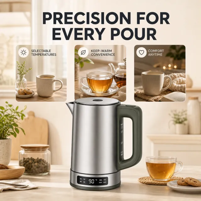
Use the provided product reference image as the sole basis for the product. Product: temperature-control kettle. Copywriting must be in English, and brand placeholders should use MOCKUP only. Visuals should follow high-end commercial e-commerce photography standards—sharp imagery, clear hierarchy, and concise, easy-to-read copy. The product’s appearance, structure, color, quantity, accessories, and relative proportions must match the reference image; products, people, icons, and props should maintain natural proportions. All essential information must remain within the safe zone, with the background extending fully to all four edges. External white borders, vertical borders on left and right, transparent fill-in borders, watermarks, contact details, social media accounts, platform information, original brand logos, gibberish, irrelevant information, or unverified claims regarding efficacy or specifications are prohibited. Titles must not appear.
【Image Composition】
Create a warm, modern kitchen feature image with neutral controls and pouring callouts. Ensure the redesigned product remains visually consistent and naturally proportioned. Keep the source language (English) for visible copy. Remove source trademarks, platform branding, template titles, watermarks, contact details, social media accounts, and comparative claims. Do not fabricate certifications, materials, capacities, medical benefits, nutritional benefits, performance figures, or any other unsupported specifications. Keep all critical content within the safe area, and use MOCKUP exclusively as the brand placeholder.
【Execution Route | Do Not Display】
If the image-generation tool can be invoked multiple times: concatenate the sharing rules with A–F separately, execute six times, generating only one 1000×1000 square image each time.
If only a single image can be generated at a time: first set the interface/API to a 2:3 portrait orientation (do not use Auto), then arrange A/B, C/D, and E/F into a 2-column × 3-row grid; ensure all six cells are equal in size and maintain a visual aspect ratio of 1:1. The outer canvas must not be 1:1.
【Sharing Rules】
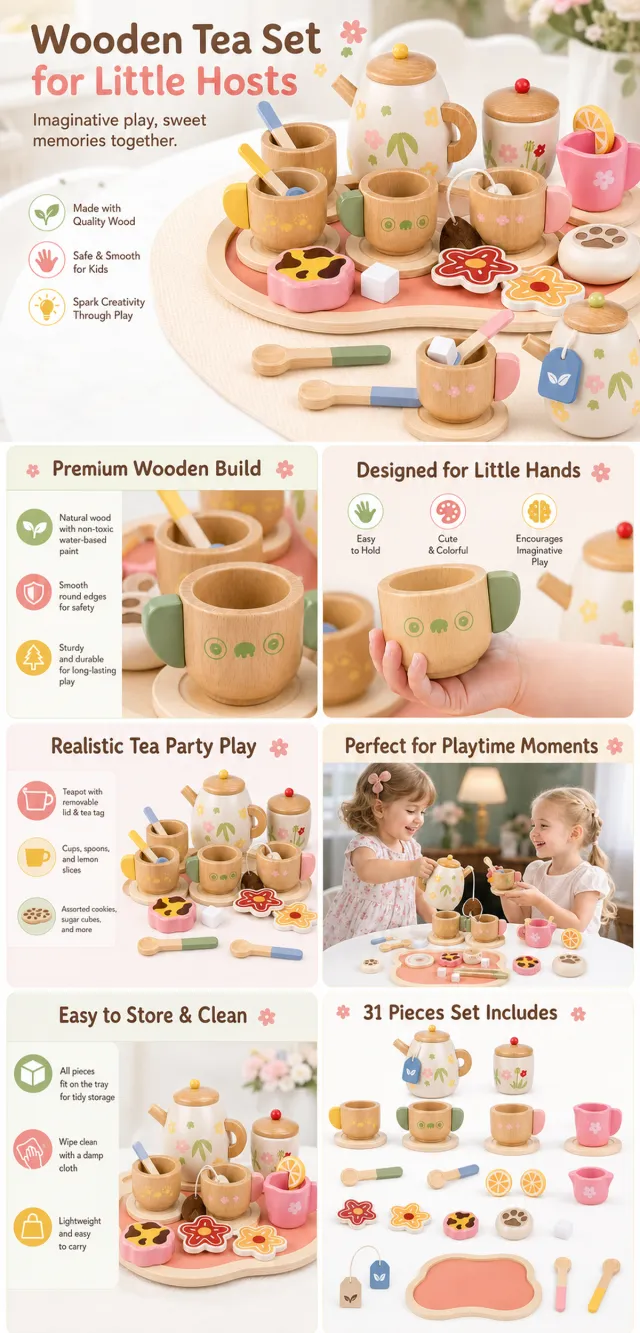
The provided product reference image serves as the sole basis for the product. The product is a wooden pretend tea set for kids. Strictly adhere to the reference image’s shape, structure, color, quantity, accessories, texture, and relative proportions; do not fabricate any components, specifications, or functions that are not shown. Use high-quality Amazon commercial photography and clear English infographics; color schemes should match the product, lighting should be realistic, and layout should be simple. Maintain natural proportions for the product, figures, hands, icons, and props—no stretching, flattening, or independent scaling is allowed. Titles, products, and labels must remain entirely within the safe area, with the background extending fully to all four edges. Only use MOCKUP for branding. No white borders, vertical bars on the sides, transparent fill-in borders, watermarks, contact information, social media accounts, original brand logos, platform identifiers, garbled text, distorted limbs, or unverified copywriting are permitted. A–F are solely control markers and must not be displayed.
【A | Product Overview】Title: “PRODUCT OVERVIEW.” The hero composition fully showcases the product along with the accessories included in the reference image; accompany it with three brief English icon-based selling points, stating only information that is visible or verifiable.
【B | Materials & Design】Title: “MATERIAL & DESIGN.” Present materials, structure, surface finishes, or styling through an overall view of the product combined with 2–3 close-up details; ensure clear labeling without inventing material names.
【C | Function in Focus】Title: “FUNCTION IN FOCUS.” Demonstrate key functions within realistic usage scenarios; maintain natural proportions among figures, hands, and the product, with actions appearing genuine and information easily understandable at a glance.
【D | Details Up Close】Title: “DETAILS UP CLOSE.” Highlight 2–4 critical structural or operational areas using magnified details and short captions; do not alter the product’s structure.
【E | Everyday Use】Title: “MADE FOR REAL LIFE.” Showcase usage, carrying, storage, or maintenance scenarios consistent with the product; retain only one clear theme and avoid duplication with C.
【F | Packaging Contents】Title: “WHAT’S INCLUDED.” Lay out or neatly display the actual products and accessories featured in the reference image, ensuring accurate quantities and relative sizes; if the contents cannot be confirmed, instead present visible specifications, dimensional relationships, or usage steps without fabricating numbers.